![Blockchain & UX: A Roadmap to building a first-class product experience [+Case Studies]](/_next/image?url=https%3A%2F%2Fapi.artkai.io%2Fwp-content%2Fuploads%2F2022%2F04%2Fblockchain.jpeg&w=1600&q=75)
Blockchain & UX: A Roadmap to building a first-class product experience [+Case Studies]
According to Finder, more than half of financial experts foresee that by 2050 bitcoin will overtake fiat currencies. That means building blockchain products simply for advanced users won’t be a sustainable business model anymore.
In the past, blockchain companies could afford to skip user research and UX/UI design steps, focusing on other competitive edges: low fees, better offerings, unique service, etc. But when crypto usage begins to replace fiat currencies, the user experience will become the main distinguishing factor, and UX issues can undermine many crypto projects’ value.
Blockchain products now have to deliver three things:
- Educate an average user on the complexities of crypto;
- Make the product easy to navigate;
- Entertain and delight a user with functionality and design.
Without even one element, “the new user” arrives unprepared, hoping to be guided and helped while also expecting a frictionless and delightful experience they’ve expected from other services. It is only a matter of time when this “new user” becomes an “average” user who abandons the service the second they don’t receive the frictionless experience and guidance they expect to receive.
To win customers' trust and loyalty, business owners must focus as much innovation on their customers' experience and resolution of UX problems as they focus on the backend development.
What is wrong with blockchain UX/UI, and Why
The consumer profile of blockchain applications has shifted massively from tech-savvy opportunists to common users with little to no technical background. However, the approach to software development has stayed similar to what it was 10 years ago and can be described in a phrase: “Made by developers, for developers.”
Even in 2022, user-centricity, especially the one that includes a broad audience of users, is not present in the majority of blockchain products. As a result, blockchain apps don't look and feel like consumer apps, more resembling control panels with lots of UX design problems.
The reason for this is that investments in UX/UI research and design for blockchain businesses can be less than 2-3%. This results in multiple UX issues and poor product performance, becoming a huge barrier to mass adoption.
5 UX problems that negatively impact blockchain businesses
There is a myriad of widespread UX problems typical for blockchain that stem from low investments in UX/U. Here we describe some of them.
1. Arcane terminology.
Proof-of-Stake, hard fork, consensus algorithm, Geth, Weth, tx hashes, seed phrase - for a novice with at best a couple of watched YouTube videos under their belt, these terms will take forever to decrypt.
Solution:
- Change long tx-hashes with emails, phone numbers, and other addresses the user understands.
- Employ simple, human language instead of jargon.
- If you can't replace new terminology, explain it with microscopy.
2. Difficult onboarding.
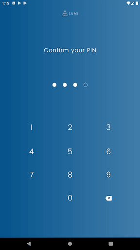
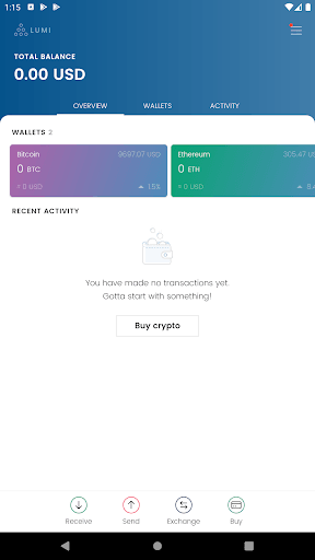
In the blockchain, onboarding is almost always long and frustrating. Due to the abundance of regulations and identity verification procedures, users sometimes need to download another app to onboard. This leads to dropouts during onboarding, which we covered in this article about onboarding. Plus, the registration process is rarely educational and leaves people puzzled about their future actions.
One of the examples of this onboarding problem is the Lumi wallet:
Solutions:
- Go through the regulatory challenges yourself. Put the registration process in your app instead of redirecting people to another application and creating more hassle.
- Involve UX professionals who know how to navigate the regulatory complexities in a customer-centric manner. This will help avoid serious UX problems by delivering a bureaucratic and cumbersome onboarding experience.
3. No explanations of the processes.
Account-related issues, blockchain wallet problems, operation approvals with transactions staying pending for many minutes - such things are typical for this complicated and immature technology. But the average user doesn't know that, and witnessing such things can deeply unsettle users and turn them away from your product.
Here is an example of a problem review: “We received a Bitcoin Cash transaction into this wallet 2 days ago, and the official blockchain shows that this transaction has received 76 confirmations. However, this app refuses to show the transaction as confirmed. It shows the transaction as pending with zero confirmation. But it is still pending showing no confirmation, and I am not able to transfer my ether to anybody; these people have totally hijacked my wallet, and I am at their mercy now.” (Source)
The person is convinced that something malicious has happened, while in reality, there are many harmless reasons for pending transactions.
Solutions:
- Use UX microcopy in the form of nudges, cues, prompts, and warnings to communicate to users what is going on and give recommendations on how to behave when they encounter UX issues.
- Once the user does something, and it hasn’t been confirmed on the chain yet, but there’s a high chance of it being resolved, mark it on the interface right away. If something fails, you can always wind it back with an error. It’s better to reflect the intended action as soon as possible even before the system caught up with it while providing more information on the transaction status by the link.
4. Vague security warnings.
Blockchain apps invite mass adoption but fail to properly communicate to users the fundamental safety rules or warn them. When they do, they often use ambiguous language that is open to interpretations by inexperienced users.
For instance, most newcomers don’t know that it is more secure to keep cryptocurrencies in offline wallets. And some exchanges don’t provide the functionality to transfer crypto to offline wallets, allowing custodial storage only. This is a serious UX issue, considering that the platforms don’t inform their users about the potential risks of this option.
Here are two versions of the same alert message from an article about UX content design:
First version:

This message confuses the user about the meaning of "funds" and sends mixed signals about what they can and can't do and why posing serious UX design problems and user concerns.
Second version:

In contrast, this message is clear, unambiguous, and self-explanatory. It also contains a CTA leading to a more detailed article.
Solution:
- Detect all the points and actions where users may put their funds at risk and create a clear microcopy explaining everything in the user’s language.
5. Unclear financial statements and fees info.
You rarely see a description of important cryptocurrency distinctions (token, a medium of exchange, or the store of value). Prices differ from platform to platform; the exchange rate and transaction fees aren’t always clear, posing a risk of overspending.
Again, for a new and uninformed user, it’s unclear how fees operate in the blockchain. When they see a fee without any context about where it comes from, it becomes a source of stress.
Here is the example from the BRD wallet:

This UX problem is illustrated by the following review on Play Market about the Coinbase app:

Solution:
- Include a basic tutorial for using a wallet and specifications on using private and public keys. A novice needs to understand that not all crypto can be purchased with fiat (regular USD or EUR) and that many transactions require ETH (Ether) to be in the wallet to pay transaction fees, etc., which can help avoid frustrating UX problems.
How to create a perfect user experience in your blockchain product
While good user experience always means user-centricity, there are often different ways to reach it depending on the specific product. Every type of product has its specific user needs and challenges that should be addressed in the UX/UI design, and these user needs and potential UX design problems can only be determined by professional research.
But revealing the specific needs and challenges with your product is only half the battle; you must also find the solutions to the detected UX issues. There are cases when some revealed UX problems can't be fixed right away as the company doesn't have the needed resources. In such instances, the design team finds ways to address these problems in the design, so they don't affect the product experience.
It is impossible to do without a) having an internal design team or b) involving a remote team of professionals with relevant experience. Artkai will be happy to assist you with UX/UI design, branding, or end-to-end development for your crypto, blockchain, or NTF project. Get a quote or free consultation from our team!
Here are the steps we followed in Artkai that allowed us to create first-class experiences for successful NFT, blockchain, and crypto products.
For blockchain startups:
Conduct a full cycle of research
This stage should always result in having the following deliverables:
- Customer profile and user roles
- User needs and pain points
- User flows
- Lean business model canvas
- Competitor analysis worksheet
- SWOT
- Business requirements
- Product roadmap
- Business processes analysis
- Functional requirements
- Non-functional requirements
- Features backlog
- Customer journey maps
- Product architecture
Create an MVP, PoC, or Prototype
The main benefit of a prototype and MVP is a preview of your product used to get honest user feedback by launching pilot versions. We use this information to improve the product further, minimize UX problems, and increase the chances of success. Another major benefit is the ability to demonstrate value to your target audience and prepare them for the launch.
To determine if your startup needs a POC, Prototype, or MVP, check out our comparison article.
Implement and iterate
During the implementation stage, all the design concepts get implemented until the desired result is reached.
For businesses with existing products in the blockchain:
Conduct UX/UI audit
UX/UI audit of your product is necessary to:
- Find out why your product isn't performing as expected, and uncover ways to fix the UX design problems. Frequently, problems like low activity or poor conversion rates can be fixed with UX design improvements, sometimes with only a few minor retouches;
- Find out how well your competitors are performing and why, and how you can beat them;
- Boost customer experience and satisfaction by finding and eliminating pain points and frequently encountered UX issues, understanding user needs, and mapping product features to them.
- Get a detailed review and a fresh perspective from a team that has created multiple superb experiences on the blockchain. We have clients among 54 Blockchain companies invested in by Top 20 VCs.
Address the found UX issues
The duration, complexity, and amount of resources needed for this stage will depend on the issues detected during the UX/UI audit of your product.
UX design in crypto projects: Artkai case studies
Having over 30 blockchain-related projects under our belt, Artkai wants to share our experience to help crypto startups establish their brands through the design and redesign of UX for their platforms.
Here are three examples of UX/UI for blockchain projects.
Artemis - NFT marketplace and auction platform
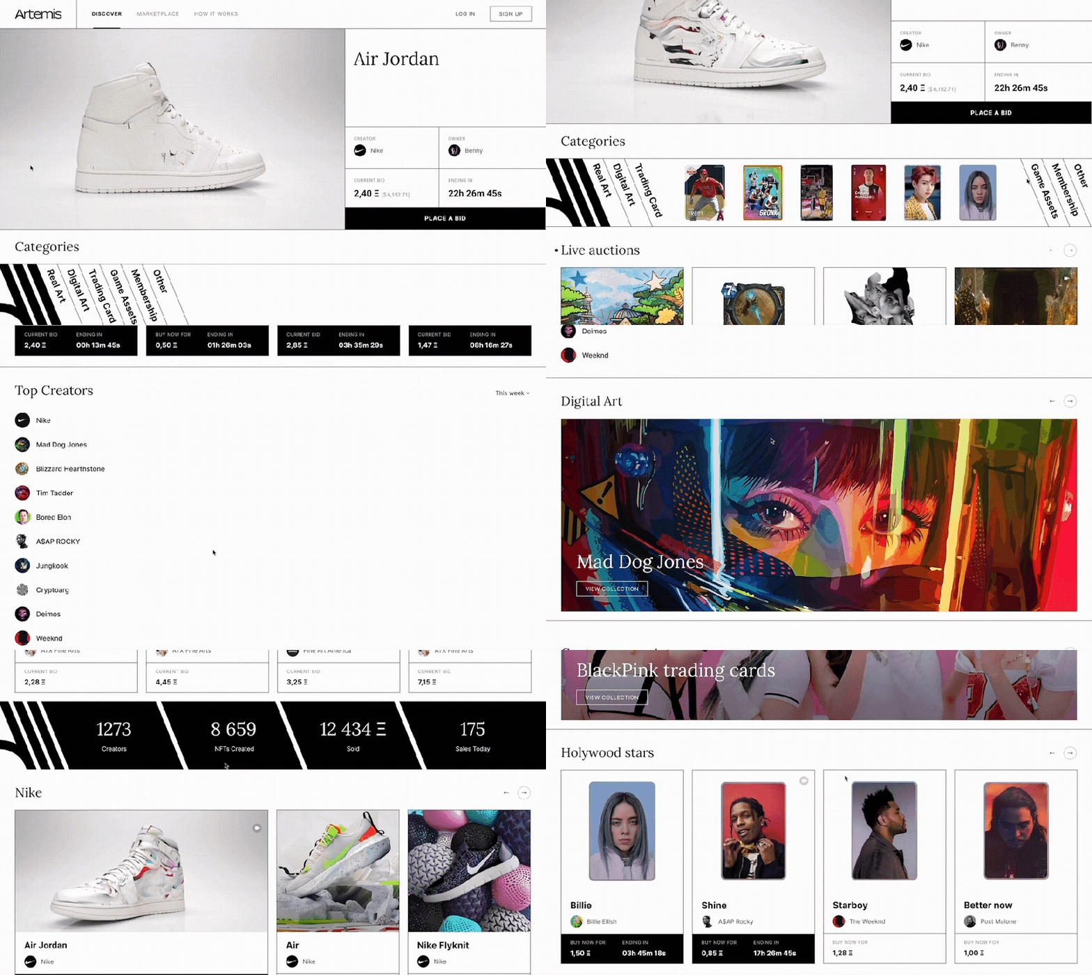
The mission of Artemis is to become a decentralized Christie’s or Sotheby’s in the NFT ecosystem. Artemis helps people enjoy digital art, involving both artists and buyers through a marketplace and auction platform.
The product had to cover a number of market niches with varied target groups of players, a proposal of affluent listings with multiple options, and unique pieces of digital art. Artemis required a unique, elegant storefront UX/UI design to dominate the NFT market as quickly as possible.
Coinhaven - an all-in-one platform for OTC, crypto trading, and exchange
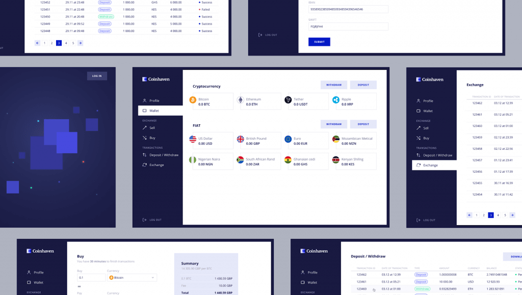
The goal of the Coinhaven platform is to deliver legally compliant and bank-approved OTC services to African countries. A unique requirement was to enable the platform to accept five major African fiat currencies.
Artkai’s responsibility was to create the UX/UI design concept and connect it with a white label crypto trading platform & exchange. Also, we had to manage the work of three independent service providers.
Huobi - a top-5 trading platform in Asia
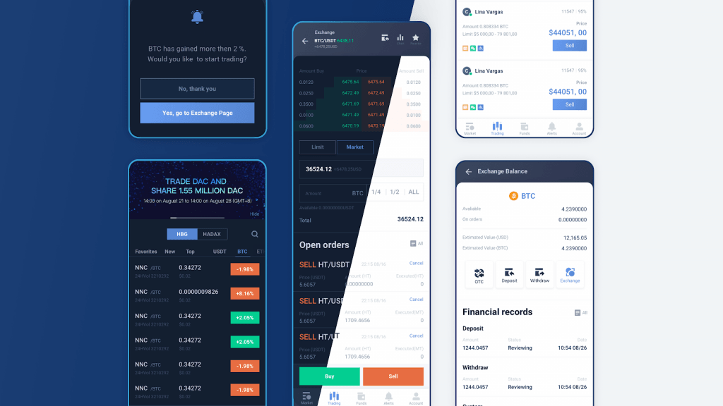
Huobi is an established Asian crypto trading platform aiming to enter the European market. Our main task was to uncover European users' pain points, UX problems and needs and address them in the customer-centric UX/UI design.
By analyzing the collected data, our team synthesized a list of insights and priorities for the platform design. This analysis helped our client enter the European market with tailored customer-centric UX design.
Need help with UX/UI design, branding, or end-to-end development for your project? Drop us a line and let's chat!
Key Takeaways
To succeed in the fierce blockchain market, you must design products that address the user need to be educated and guided while simplifying a challenging user experience with design. You can easily avoid common UI/UX design problems and become one of a few market leaders if you:
- Understand and address the needs of both inexperienced new adopters who have no background in blockchain technology and adepts in the industry;
- Make customer experiences helpful, easy, and exciting by leveraging the latest UX design trends.
Clients and Results
Schedule your free consultation
Don't miss this opportunity to explore the best path for your product. We are ready to delve into the specifics of your project, providing you with expert insights and optimal solutions.
Book your free sessionWHAT TO KNOW
Questions you may ask
What makes up a good design for user experience?
The core principle of a stellar UX design is to think like an end user and provide a clear, intuitive user journey to help everyone, from a newbie to a mature user, to accomplish their goals with your product. You should be perfectly clear about what your app should do and how it can help the user complete their task the best way. A product with a good UX should also deliver a satisfying, rewarding user experience to please people.
What are the six qualities that make up good user experience UX design?
When you start thinking about optimal UX design, always keep the following characteristics in mind.
- A great UX design should give users control and freedom in the use of the product’s entire scope of features.
- It should also prevent errors and provide simple undo pathways for users’ guidance.
- Excellent UX is always consistent with standards.
- It prioritizes recognition over recall.
- Products should look esthetically attractive and follow minimalist design principles.
- Flexibility and efficient use should be prioritized.
Which strategy is used to achieve good UX?
There are tons of variants to achieve great UX, but the basics you’ll need to take care of are always the same. You should design a sleek, intuitive layout for the product’s interface and choose suitable colors for brand consistency. Next, you should stick to the minimalist approach in features and layout elements; this can help you avoid frustrating or overwhelming the users. Strive for great personalization and visual esthetics, and always conduct preliminary UX research to understand your end user better.
Read More
Explore articles from Artkai - we have lots of stories to tell
Join us to do the best work of your life
Together we advance the human experience through design.