


In fintech, putting the quality of the onboarding experience in the back of mind is a common story. This was confirmed in a report by the identity verification service provider Hooyu, which stated that 27% of customers drop out of onboarding when asked to provide an ID document. Some firms see a staggering 50% abandonment rate at the know your customer (KYC) onboarding stage.
This means some fintech businesses are losing around 50% of their potential clients due to inefficient onboarding processes. This makes the conversion rate of marketing and sales campaigns appear low and the cost of customer acquisition appear high. This all happens in spite of an excellent value proposition, state-of-the-art technology, low fees, and fast service.
Having worked on 80+ successful fintech products, Artkai is on a mission to help many more companies get the best out of their business. Everything in this article is the result of hands-on experience designing top-notch customer experiences that drive sales and increase profits for fintech worldwide.
From this material, you’ll learn about:
Digital onboarding UX design for finance and its impact on your product’s success
In digital products, onboarding is known as a set of activities that “hooks” the interested users and helps them establish a relationship with your company and product. In other words, it is a way to get people on board with your product and convert them into customers.
The whole onboarding process can last for days and includes everything from interactions with your landing page to the post-registration in-product experience. The information display, registration, data capture, product activation, and first follow-ups are all important parts of onboarding in Fintech UI.
Onboarding impacts your product’s success in many ways. It is the ”transition stage” for a user that determines whether they will become your customer or abandon your product. Any friction or UX challenge can scare customers away and result in an increased percentage of drop-outs.
According to Deloitte, more than 40% of users abandon onboarding processes in digital channels because:
- It takes too long;
- It requires information they aren’t willing to disclose yet;
- It is fiddly and can be overwhelming.
Onboarding, directly and indirectly, affects your product’s success and profitability by improving metrics in the following two areas: customer experience and cost/income ratio. Let’s look at how it works in fintech design.
1. Better cost/income ratio is reached by:
- Shortened time to evaluate the product
- Reduced cost-to-serve due to fewer support requests and fewer person-hours spent on technical help
- Better sales due to higher customer success rates
- Reduced failed client acquisitions
- Automated processes and, as a result, higher operational efficiency and lower operational costs
2. Better customer experience is reached thanks to:
- Simplified access to financial services
- Ability to seamlessly switch between offline (in-branch) and online onboarding
- Saved time and stress
- User’s ability to keep the momentum
- Better first impression from interacting with the product with a stellar FinTech UX
- Enhanced satisfaction from the advanced digital user experience
- Reduced document loss and paper use
- Structured file archiving, and more.
Failure to onboard an already interested user means you need to spend between 5 to 25 times more to acquire a new one than you would retain the one that left (Invesp). Given how hard it is to attract new users and get them to the onboarding stage, such losses are unacceptable because they are a common reason for inadequate sales and revenue.
4 Common UX design problems in FinTech onboarding
“Building a slick onboarding process is vital. Be mindful that most people won’t have the documents at hand when they fail KYC, as they are not expecting to need them. Ensuring the process is effortless so customers can complete it easily is of high importance at Lerex.”
Jill Trembeth, Lerex Technology.
Onboarding in financial products differs from onboarding in other industries and has unique FinTech challenges. The risk of fraud and the need to comply with multiple security regulations like KYC and anti-money laundering (AML) make fintech onboarding much more focused on security than most other industries.
Security requirements often turn what is supposed to be a simple registration process into a bureaucratic nightmare. Each additional layer of protection adds friction and confusion, bombarding users with fields and screens and requesting mountains of documents and personal information.
The main UX challenge for modern fintech products is to fulfill security requirements with minimal friction.
Excessive friction ruins the UX and decreases the conversion rates of marketing and sales campaigns.
Problem №1. It is too long.
According to the Incognia report, the top financial services like Stripe, Robinhood, PayPal, or Credit Sesame onboard their users in 6 minutes on average. It takes 14 screens, with 16 fields to be completed and 29 clicks required of the user.
However, for most fintech companies, the story with onboarding looks way less optimistic. Hooyu report states it takes up to half a day for an average fintech product to onboard a user, and over a third of products require longer than a day to complete onboarding.
How can businesses expect high conversions when a registration process takes up to two days to complete in an age when users expect it to take only a few minutes? This UX design challenge definitely needs to be addressed to achieve better user adoption.
Problem №2. It is untimely.
The information collection timing makes sense for a user just as it does for compliance purposes. Many apps we have examined required prospective customers to provide more personal and business information than was really needed at the first stage of signup. This was a huge friction point and drove people away from the signup process.
It doesn’t mean you shouldn’t ask customers to provide the necessary information; it means you should ask it in the right way and at the right time without interrupting the user flow. One way to remove the UI/UX design challenge includes enabling users to pause the registration and come back with the needed information when it’s comfortable for them without starting it all over again.
Problem №3. It is bureaucratic.
Traditional financial institutions require users to provide volumes of documents during onboarding, and digital fintech companies seem to be taking the same road. Instead of gently spreading out the process and letting users skip steps and get back to them later, users get knocked down with mandatory fields right away.
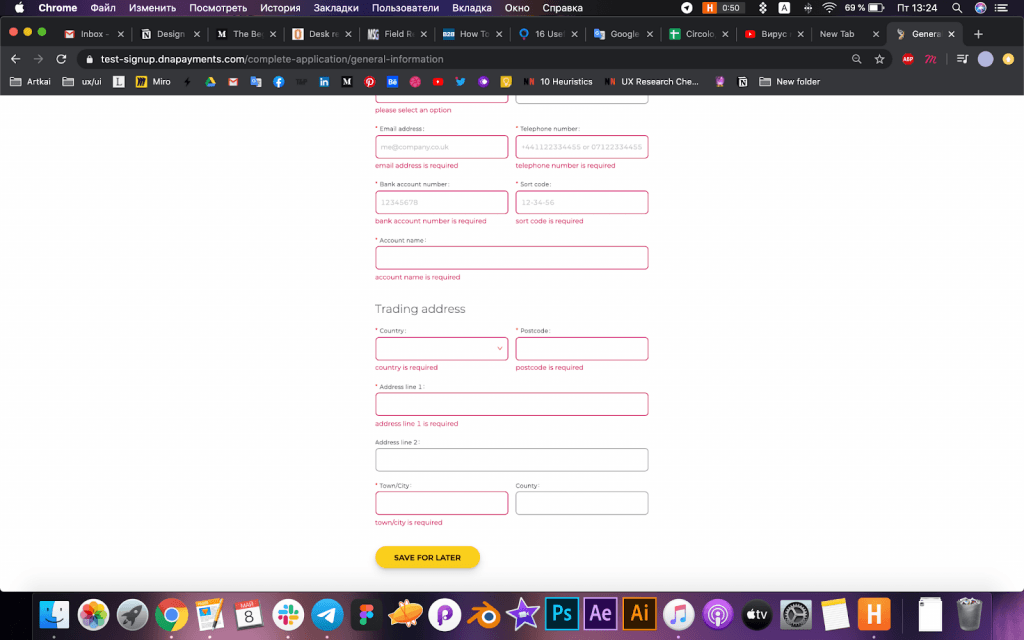
Example of an onboarding step in a payment service (our client’s case)
Problem №4. It is unclear.
Good onboarding provides just enough explanation and doesn’t provoke unanswered questions like “why do you need this information?”, or “why now?”. Unfortunately, the registration process in most products is unclear, entangled, and requires assistance, which is one of the biggest UX design challenges for a fully digital product.
Here are the key areas users are left in the dark about:
- Information. Why do you ask for certain information? How are you going to use it?
- Progress. How much time is left to finish my onboarding? What am I missing to get this done?
- Requirements. Why does this field light up in red? Why can’t I submit this form?
These problems should be detected and addressed with a mindful UX design for FinTech, helpful microcopy, and a well-thought-out customer journey. Otherwise, you may end up with too many UI/UX design challenges, creating friction points and annoying prospects who give up on your product.
How to evaluate the quality of your current onboarding UX
Here is how to check if your current onboarding is on par with customer expectations and competition.
1. Look at your funnel metrics. Analyzing your onboarding funnel metrics is the first and most important step to understanding whether your users experience UI UX design challenges at onboarding. Here is what to look at:
- Conversion rates of your marketing & sales campaigns. Low conversion rates while having a decent USP can signal that the problem is in onboarding;
- Onboarding completion rate. An acceptable range is between 75% and 100%. Everything lower than 70% is a red flag;
- Abandonment (drop-out) rate. Everything higher than 30% is worth looking at;
- Points/stages of abandonment. The specific places where your users drop out will expose the friction points you need to focus on and smooth out to reduce abandonment.
3. Collect customer feedback. Send a questionnaire, conduct customer interviews, etc.
4. Test your onboarding. Ask someone you know or hire a UX professional to test the quality of your onboarding process.
Need help creating a stellar onboarding UX for your fintech product? Come to a free Artkai consultancy session, and let’s discuss your case!
Case study: How Artkai solved onboarding UX problems for DNA Payments Group
Artkai’s client case DNA Payments Group will illustrate the common UX design challenge examples in fintech onboarding and show how Artkai’s human-centric design can fix them.
Business
DNA Payments Group is a UK-based payment processor that works with over 30,000 small-to-medium businesses in the UK. Consisting of Optomany, 123Send, and the 123Hire brands, DNA Payments specializes in omnichannel payment processing technology. DNA Payments delivers innovative, reliable, and secure solutions to the retail sector across all channels.
Challenge
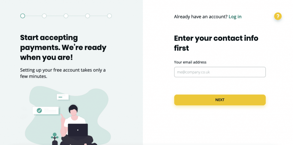
DAN Payments came to Artkai to redesign and improve the onboarding process and registration flow for their existing product. The new onboarding structure and design were planned to be used for their other products. The previous onboarding process was having a negative impact on the user experience and was impeding customer acquisition. They needed us to uncover the problems with the Sign In & Sign Up processes and fix them.
Issues detected
While conducting our initial research, we discovered several ways that the existing FinTech app design was confusing. Starting from the landing page, the users had challenges choosing a price plan, finding necessary items, and later working with data tables and filters. The whole registration process took a couple of days - from selecting a price plan to setting up an account and making a payment. In contrast, Stripe took only 3 minutes to get on board.
Also, the Login and Sign Up pages had a different appearance and design which caused confusion and weakened the brand image.
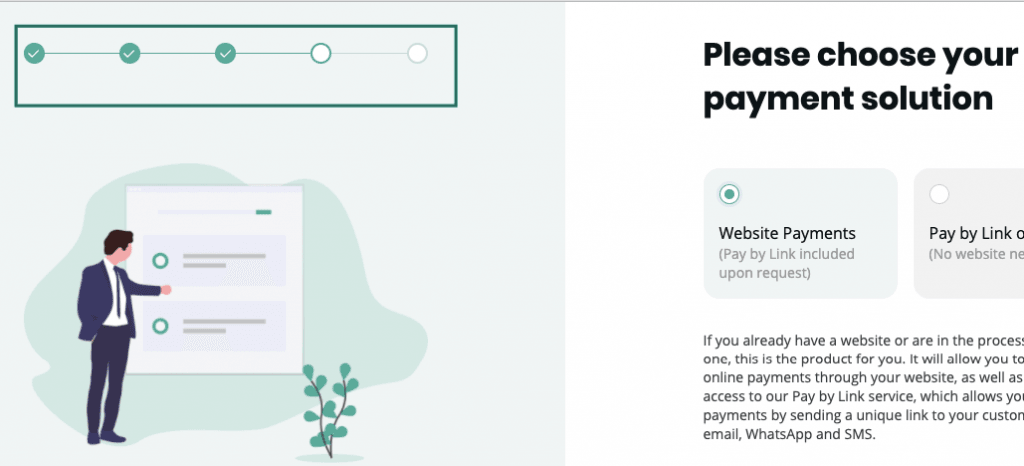
Solutions
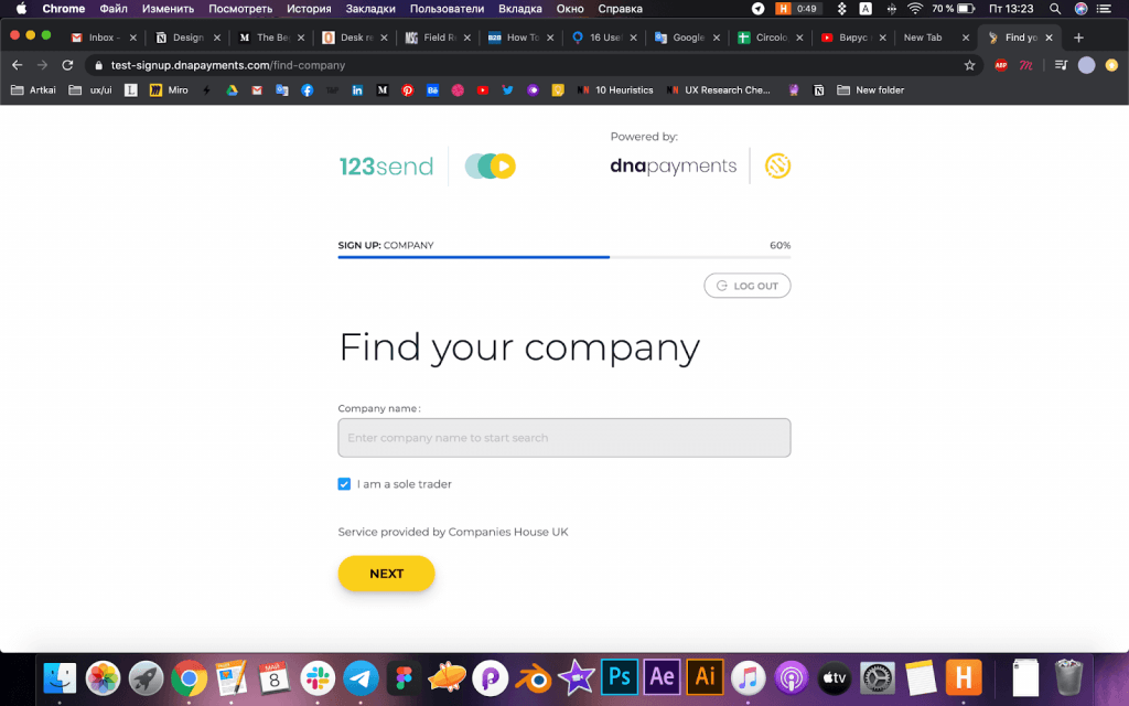
Here is how Artkai changed the registration flow:
1. We created a new and consistent UI design across all the pages that reflect the company’s brand identity.
Old design:
New design:
2. We added a wizard progress tracker (stepper) so users could see where they stand and how many steps they have left to finish. This gave new prospective customers a sense of advancement and it reduced anxiety.
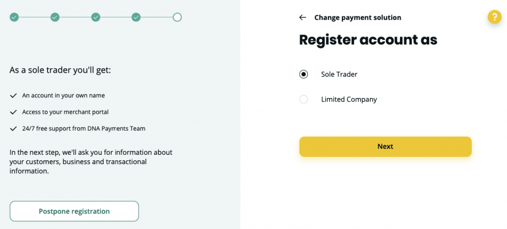
3. We added a separate option to register an account as a Sole Trader (Sole Proprietor) and explained what different services users would get if they register as a Limited Liability Company. This removed the ambiguity.
Old design:
New design:
4. We reduced the number of fields to only those necessary to onboard a user. It significantly shortened and simplified the whole process.
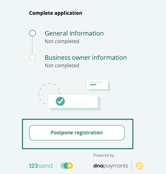
5. We added a Postpone Registration option which allowed users to pause their registration and save all the information entered earlier so they could return later and pick up where they left off.
6. We removed the Product Selection step from the registration flow and placed it on the landing page. This preceded the registration and made more sense because users get confused when they have to choose a tariff plan while they are setting up their accounts. These are two separate actions that require different thought processes.
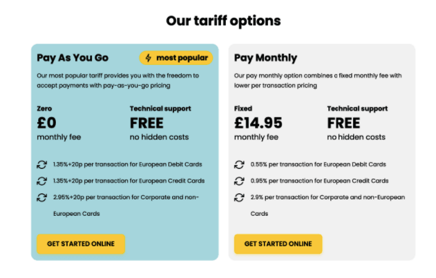
Updated landing page with clear tariff options
Results
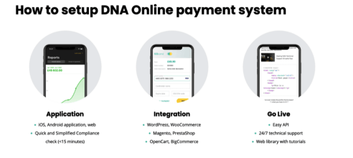
We fixed the product’s UX issues, optimized the overall financial UX design, redesigned search functionality, simplified access to information, and made the process clear for the user. It led to the following results:
- Onboarding time is reduced from multiple days to 10 minutes;
- A fully digital online setup;
- A simple, clear, and self-explanatory registration from start to finish.
Examples
For more compelling design cases, check out our other recent work.
Summary
The business case for investing in a better onboarding experience in fintech products is clear: its quality directly affects key business metrics. If your customer acquisition goal for a month is 5,000 new customers, failing to onboard 20% of the users means you lose 12,000 potential customers a year. So, it’s vital to explore various UX design challenge ideas and seek UX improvements in every aspect of onboarding, thus raising your product’s usability and appeal for users.
Compelling Fintech UX design isn’t just about aesthetics; it’s when a product makes sense to your clients, your business, and you. Drop a line to our design wizards, and let’s discuss your case!
Clients and Results
Schedule your free consultation
Don't miss this opportunity to explore the best path for your product. We are ready to delve into the specifics of your project, providing you with expert insights and optimal solutions.
Book your free sessionWHAT TO KNOW
Questions you may ask
What is UX in Fintech?
UX in FinTech is about ensuring that your users receive a rewarding, pleasant, and frictionless experience when using your digital product. Stellar UX is always user-centric, meaning that the FinTech product should be designed in a way that people like, understand, and find easy to use. Besides, the FinTech industry is getting increasingly competitive, and new startups can hardly survive without excellent design and functionality. So, FinTech-specific UX should include mobile-first functionality, simple and intuitive layouts, ultimate personalization, and extensive self-service options.
What are the steps that are used for solving UX problems?
The first step in the process is to ensure that the problem really exists and that it is UX-related. Once it’s confirmed, you need to break it down into manageable components to understand what went wrong and why it emerged. It’s also vital to uncover the magnitude of the problem. For instance, how many users or how much revenue does it cost your firm? You can assess the impact by looking at your core business stats. Next, you should develop a UX redesign and ask users whether they like it; incorporate the solution only after validating the redesign’s value, and don’t forget to track changes in several follow-ups.
What should you not do in UX?
Erroneous UX decisions can cost you users and money, so it’s better to avoid some tried-and-tested UX failures and flops. Some of them are an exclusive focus on esthetics (at the expense of core functionality), neglect of user feedback, overwhelming pop-ups, poor attention to UX microcopy, too high cognitive overload, and inclusion of dummy, unresponsive design elements. Confusing categories and lack of UI logic can also kill UX and result in poor user adoption.
Read More
Explore articles from Artkai - we have lots of stories to tell
Join us to do the best work of your life
Together we advance the human experience through design.