
June 16, 2023
4 successful digital transformation case studies for businesses to learn from
Last week alone, we had around a few dozen calls with potential clients considering embarking on a digital transformation journey. They came from different industries and business models, but their stakeholders had the same core questions and concerns:
- What are the odds that a transformation is going to work for our situation?
- How can we handle the restrictions in our industry?
- We want to enhance the digital customer experience, decrease operational costs, improve workflow and productivity, and win market share without overspending - can digitalization help us achieve those goals?
- What results has Artkai produced for digital transformations in automotive, fintech, eCommerce, healthcare, energy, etc.?
- How many resources will it take us to get where we want?
This post will try to answer the questions above with four real-life digital transformation success stories from the energy, automotive, and fintech sectors brought to life by the Artkai team. We approached each situation with human-centricity in mind because we believe it is the only way to deliver results that really work for businesses and their clients.
While NDA agreements don’t let us reveal certain details, these examples give compelling reasons for digital transformation in the small-to-medium enterprises (SME) segment.
We present each case below with the following outline: Who (company); Why (goals); How (solutions); What (results).
Let’s dive into the details!
DTEK Case Study. Digital System for Electrical Power Consumption and Billing Management for Three Million People
Industry: Energy, utilities
Duration: Ten months
Services: Market, Competition & Trends Research, On-site Workshop, Customer Research, UX/UI Design, Front-end Development, QA testing
DTEK is a Ukrainian power distribution system operator striving for leadership in the European energy markets. DTEK companies produce coal and natural gas, and generate electricity with thermal power plants and renewable energy power plants, providing heating and electricity to consumers.
DTEK’s digital transformation objectives
- Create the first digital solution across CIS countries that enables online, account-based electricity consumption and electricity billing management.
- Increase the quality of service;
- Reduce resources required to keep the system functioning;
- Minimize paper consumption and therefore reduce associated costs;
- Eliminate costs for third-party transaction fees;
- Cut the red tape and streamline electricity-related operations;
- Provide effortless reporting of meter readings to ensure accurate reporting and forecasting
Solutions for DTEK
An exciting and focused ten-month collaboration (followed by a year of occasional support and minor enhancements), resulted in the following digitalization solutions for DTEK:
Online account management
- The ability for users to manage the overall account, settings, and profile information;
- Ability to edit customer profile information, account preferences, and payments.
Electronic bills and payments management
- We enabled users to analyze their bills, compare rates, pay online, view payment history, make billing queries, and view payment options. Here’s what customers can find in the user interface:
- Current balance and billing details
- Bill break-down, including energy charges, associated fees, and taxes.
- Information on payment options
- Customer agreement details
- Contact support via digital channels for billing-related questions.
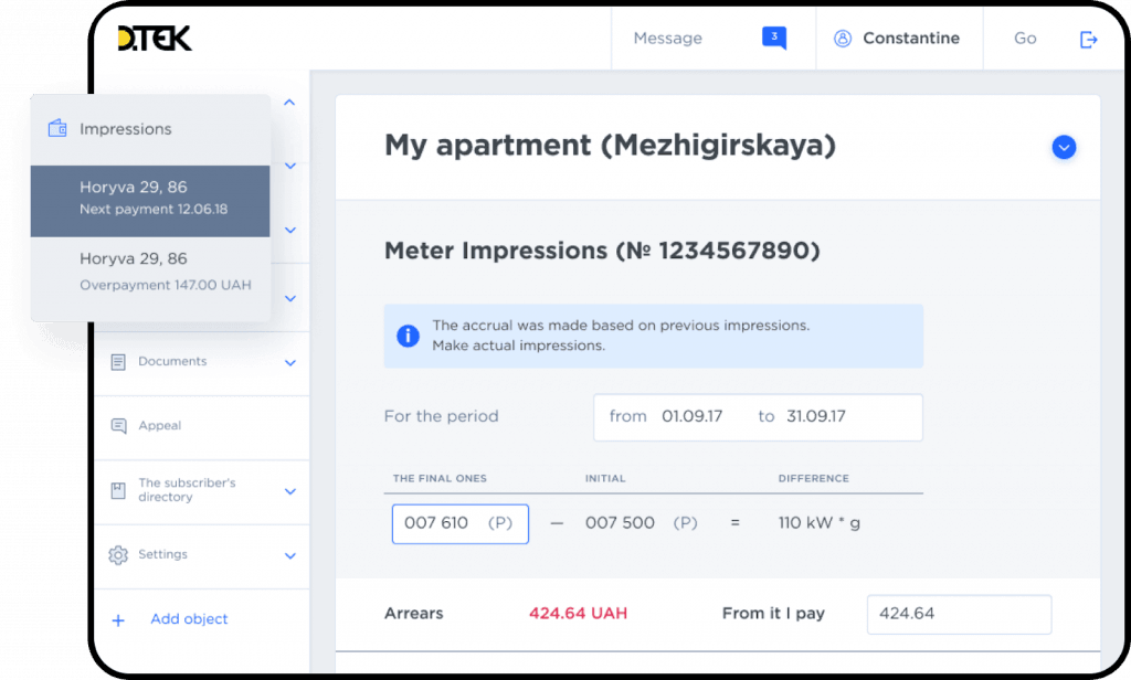
Billing management interface in the new DTEK website
Energy consumption management
- Report meter readings;
- Review historical usage information, yearly and monthly usage data, and energy-efficiency benchmarks;
- Receive efficiency tips, learn about rebates, and sign up for energy-efficiency tips.
Real-time outage reports and alerts
- View current and planned outages and communicate with utility customer service agents to address outage-related notifications
Self-service options
- Enter and log customer service requests anytime and check the status on the go. Complete service request forms for:
- Meter replacement
- Variation of contractual power capacity
- Contract amendments
- Audit and Violation acts
- Manage contracts when changing residency
- Connect in real-time with the operator and receive status updates on self-services
Centralized notifications
- Users now get a single view of all communications with the operator
- Ability to configure multi-channel notifications.
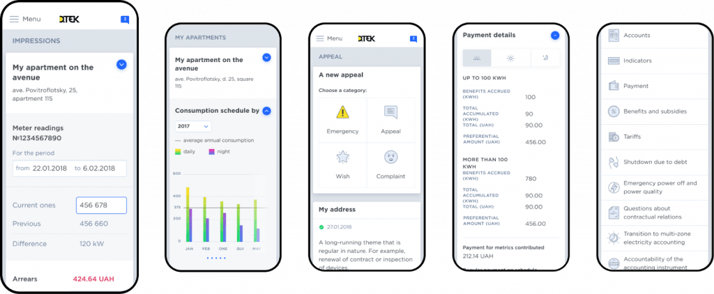
DTEK mobile design interface
Results of digital transformation:
- Increased adoption and use of digital customer engagement tools;
- Reduced call-center load and lower cost of customer service operations;
- Better data integrity and understanding of the customer base;
- Enhanced ability to meet customer needs through meter data management, analytics, and alerts;
- Improved communication with customers through online information exchange and notifications.
It was our biggest digital transformation in the energy and utility industry so far, and we are very proud to have successfully accomplished it. To find out more about the project, discover the full case.
Auto Access Case Study. Digitalization and complete UX redesign for Auto Accessory Company
Industry: Automotive
Duration: Seven months
Services: Market, Competition & Trends Research, On-site Workshop, Customer Research, UX/UI Design, Front-end & Back-end Development, QA Testing.
The next company is Auto Access - a Belgian automotive company specializing in the sales and installation of a wide range of accessories for pick-up trucks, 4x4s, and passenger cars to dealers. They’ve been one of the leading Benelux auto accessory providers for over twenty years before they decided to undergo digital transformation.
AutoAccess’s digital transformation objectives
The company was looking for ways to boost its revenues and provide more value to customers via its website. In practical terms, this meant they had to:
1. Decrease costs on business operations by increasing the efficiency of their workforce and giving them more online tools;
2. Keep up with the new trends and customer expectations from buying experience in the automotive e-commerce market;
3. Enter the B2C market, targeting car owners and making their shopping experience as frictionless and convenient as it is for B2B users ;
4. Expand the range of car parts they offer in their online catalog, adding parts for light commercial vehicles and passenger cars.
Solutions for Auto Access
Here is what Artkai created for Auto Access with its digitalization efforts.
A single database
A single database for e-commerce products and workshop services that is synchronized with the website and the ERP system.
Functional admin panel
- Easy addition of new products
- Easy management of the website content
- Quick addition of new microsites (branded websites for official dealers)
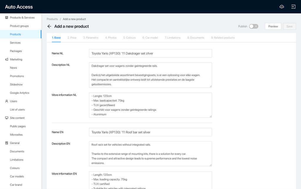
New AutoAccess admin panel: adding new products
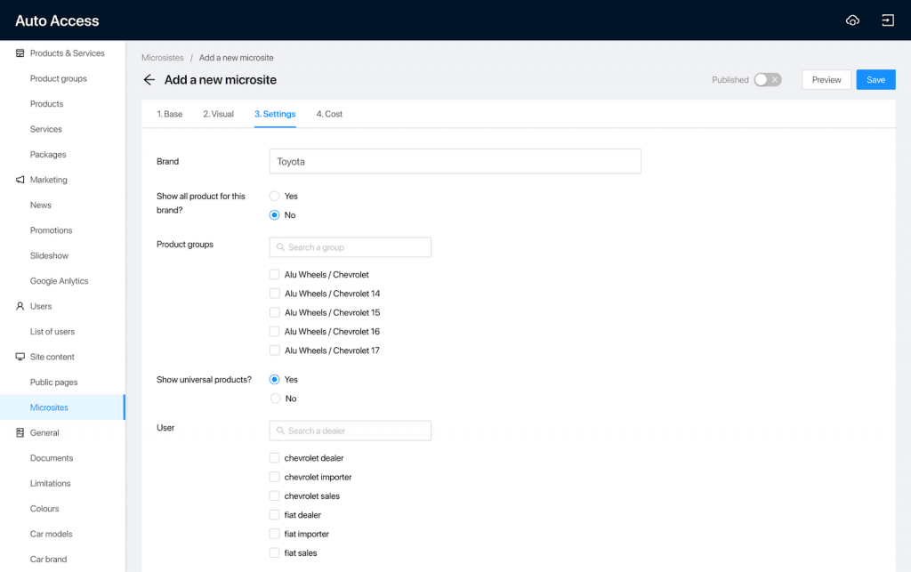
New AutoAccess admin panel: adding new microsites
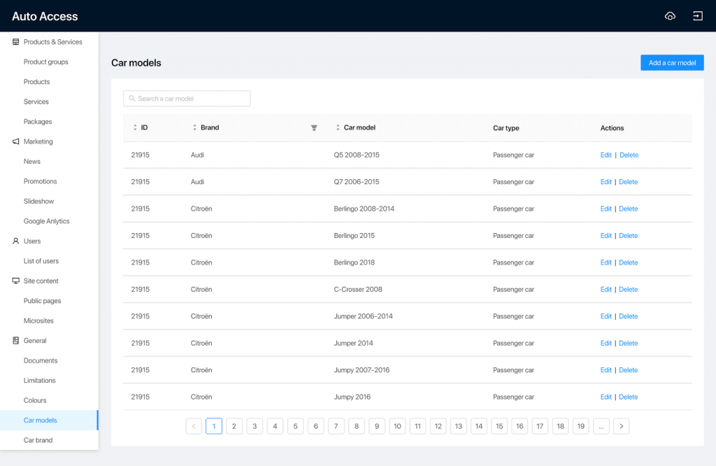
New AutoAccess admin panel: making edits to the existing product line
New search functionality for users
- Filter by elements of interest
- Price management
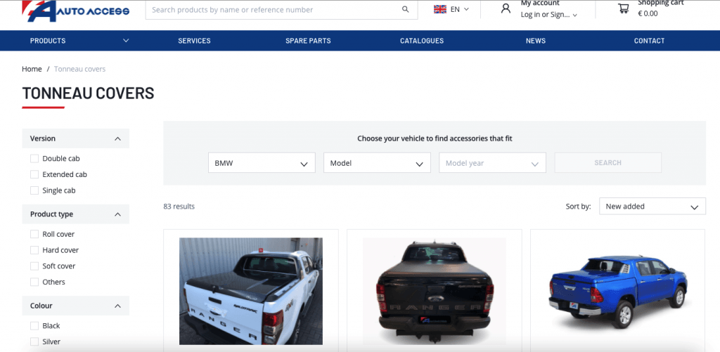
Websites' new search functionality for B2C users
Upgraded technology stack
We came up with a new technology stack that allows flexibly adding new features, fostering business scalability and potential growth.
Old design:
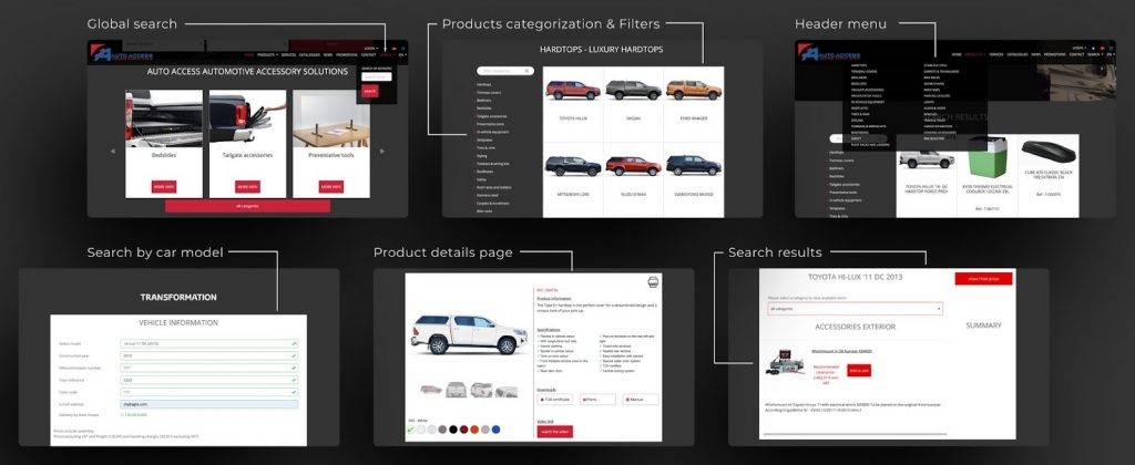
AutoAccess' old website design
New design:
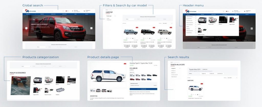
AutoAccess' new website design
Results of digital transformation:
- 50% decrease in time to fill in the website admin panel;
- 2,5 times decreased the cost of adding new features to the website, resulting in higher business scalability;
- Order is made 1.6 times faster;
- Built UX that decreased the manual work 3 times;
- Successful entry into the B2C market;
- Streamlined and automated business operations and workflow;
- Intuitive and convenient navigation for B2C and B2B users;
- Higher efficiency of marketing and sales specialists.
If you want more information on AutoAccess’ digitalization process, read the full case study.
ProCredit Bank Case Study. Large-Scale Digital Transformation for Banking Online Services Across 13 Countries
Industry: Banking, Fintech
Duration: Seven months
Services: Market, Competition & Trends Research, On-site Workshop, Customer Research, UX/UI Design, Front-end Development, QA testing, Ongoing support, and maintenance.
The business that undertook digital transformation was ProCredit Bank Georgia. ProCredit is a well-known full-service commercial bank operating in South-Eastern and Eastern Europe, South America, and Germany.
ProCredit bank provides its clients with essential financial services: lending to individuals and business entities, deposits, cash settlement services, acquiring, bank guarantees, payroll projects, and safe deposit box rentals.
ProCredit’s digital transformation objectives
ProCredit Bank Georgia approached Artkai in May 2019. They set out the following goals for the transformation:
- Create a system across all online platforms that would elevate customer experience and present the bank as an innovative, transparent, and simple-in-use banking solution. This ecosystem was meant to be used in 13 countries across all online banking mediums - web applications, mobile applications, ATMs, and marketing materials.
- Provide banking services through digital channels and promote cashless operations by making online transactions effortless and efficient;
- Ensure a high level of accessibility, speed, and quality of services by making each channel fast, comfortable, and flexible;
- Minimize the time needed to complete banking operations;
- Facilitate the automation of routine, standard transactions and, thereby, enable a greater focus on providing customers with financial advice.
This project required Artkai to reassemble and redesign every part of the digital ecosystem to become human-centric, consistent, and cutting edge.
Solutions for ProCredit bank
Web internet banking
- Fast access navigation based on past user habits to help them effortlessly find key banking elements;
- Add a “Favorite” section to allow clients to customize their menu by adding the most often used elements;
- A card with notifications about the bank’s updates and new features. In the past, clients said they didn’t even know a number of features existed; Artkai solved this usability problem;
- Friendly prompts to help users comfortably complete multi-step operations without the need to seek help from the call center.
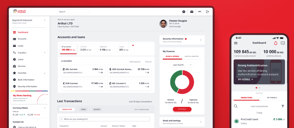
ProCredit bank's dashboard on the new web and mobile interfaces
Mobile banking
- Contactless account registration via internet banking or video identification tools enables users to create new bank accounts without visiting the branch.
- Smart login with quick and secure four-digit passcode or Touch/Face ID options instead of “Login” and “Password”.
- Prefilled transfers are placed as horizontal cards at the top of the screen. It sped up transfers & payments by separating repeated (automatic) transactions from ones that required manual completion.
- Automated payments with fixed dates “from/to” and the frequency of the payments to remind clients about paying for their products and services.
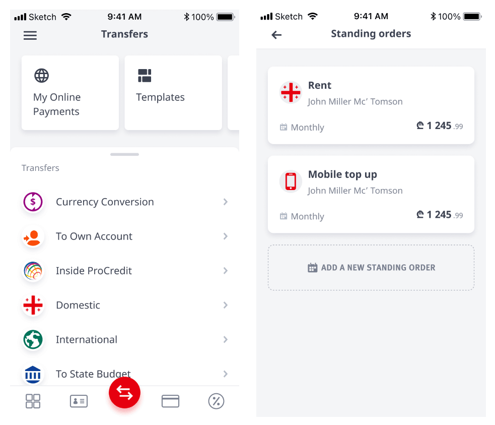
ATM interface & card design
We also designed a new interactive interface for the bank’s ATMs and cards. The main idea was to provide an automated and consistent experience for customers.
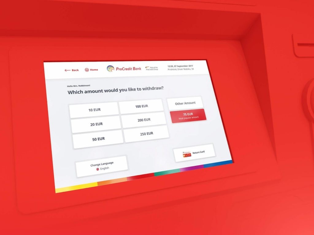
ProCredit bank's new ATM interface design
Old design:
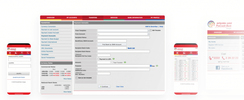
Old ProCredit bank's web and mobile interface
Results of digital transformation:
- 99% of available banking services are now digitized and can now be performed fully online;
- Seamless and quick contactless registration and login processes for clients.
- Drastic decrease of contact center calls regarding interface-related difficulties;
- 1.5x faster to make a transfer via web or mobile banking;
- 2x faster login process compared to the previous version;
- 60% faster to block a card via mobile application;
- Fostered remote work;
- Significant increase of positive feedback about the bank services, their usability, and functionality;
- As a result, the share of automated services and transactions was distributed mainly as:
- 50% E-banking
- 25% POS transactions
- 22% ATM operations
- 3% Other
To find out more about the process, restrictions, and design, check out the full ProCredit case study.
Case Study QVANS - Digital Transformation of a Seller of Custom Upfitting Services for Commercial Vehicles
Industry: Automotive
Duration: Four months
Services: Market, Competition & Trends Research, On-site Workshop, Customer Research, UX/UI Design, Front-end Development, QA testing.
Andex, one of the largest car dealers in Belgium, had been the market leader for ten years before they decided to go digital with their new project called QVANS. QVANS is an automotive B2B and B2C one-stop shop to sell custom-fitted commercial vehicles in Belgium, the Netherlands, and France.
Andex’s digital transformation objectives
Andex’s motivation to go digital with its Qvans project was to gain a competitive advantage in the automotive market. The owners wanted to achieve this by delivering a superior online customer experience.
Andex initially came to Artkai with a request to create a new website. , But there was more to it. What made it a special digitalization task was the integration of the existing CRM system with the new website, the addition of cloud storage for images, and configuring a third-party email delivery service.
Andex had the idea to offer an automated Digital Advisor. This advanced search feature allows customers to select the desired van parameters and get suitable suggestions.
Solutions for QVANS
New visual brand identity
- Unique branding icons that highlight and distinguish the company’s ultimate professional service gear;
Custom car icons for QVans
- Unique colors that distinguish each industry our client works with to evoke positive associations. For example, we used orange for Building & Construction industries; for the Gardening sector, we picked green; light grey was used for all the brands; and QVANS brand dark blue for the vehicle types. For the call-to-action graphics, we used the QVANS brand pink color.
Digital advisor
- This is a unique feature that enables users to select requirements (industry, models, brands) and get a list of well-matched vans. It lets users quickly choose a suitable van without scrolling through the whole list of vans and site sections.
Informative previews
- Users can immediately see all the key information about the product without opening each page: the price, towing capacity, load space, etc. If they’re interested, they can go deeper to the product detail page.
Intermediate server for storing the images
Product architecture for growth
- Middleware is a database that enables marketing and sales folks to conveniently work with the existing customer base by integrating the existing CRM and the new website.
Results of digital transformation for Andex:
- An established automotive eCommerce brand QVANS with a distinct image and features tailored for a niche customer;
- Streamlined and automated client acquisition process and data management;
- Competitive leverage on the automotive market;
- Ensured high-quality customer buying experience;
- High website performance.
To discover more of the processes and results, explore the full case on Behance.
Conclusion
There are many different ways that digital transformation can benefit your business. You don’t have to break the bank to implement significant improvements with digitalization. All you need is to approach it mindfully and with intention.
By outlining why you’re pursuing digital transformation and finding a team of experienced subject-matter experts, you can find the most cost-effective way to become a successful digital company.
Want to find out how digitalization can grow and profit your business? Do you have digitalization ideas and business goals in mind? Let’s connect and discuss the best ways to get them!
Clients and Results
Schedule your free consultation
Don't miss this opportunity to explore the best path for your product. We are ready to delve into the specifics of your project, providing you with expert insights and optimal solutions.
Book your free sessionRead More
Explore articles from Artkai - we have lots of stories to tell
Join us to do the best work of your life
Together we advance the human experience through design.