
Marketplace for new and used cars
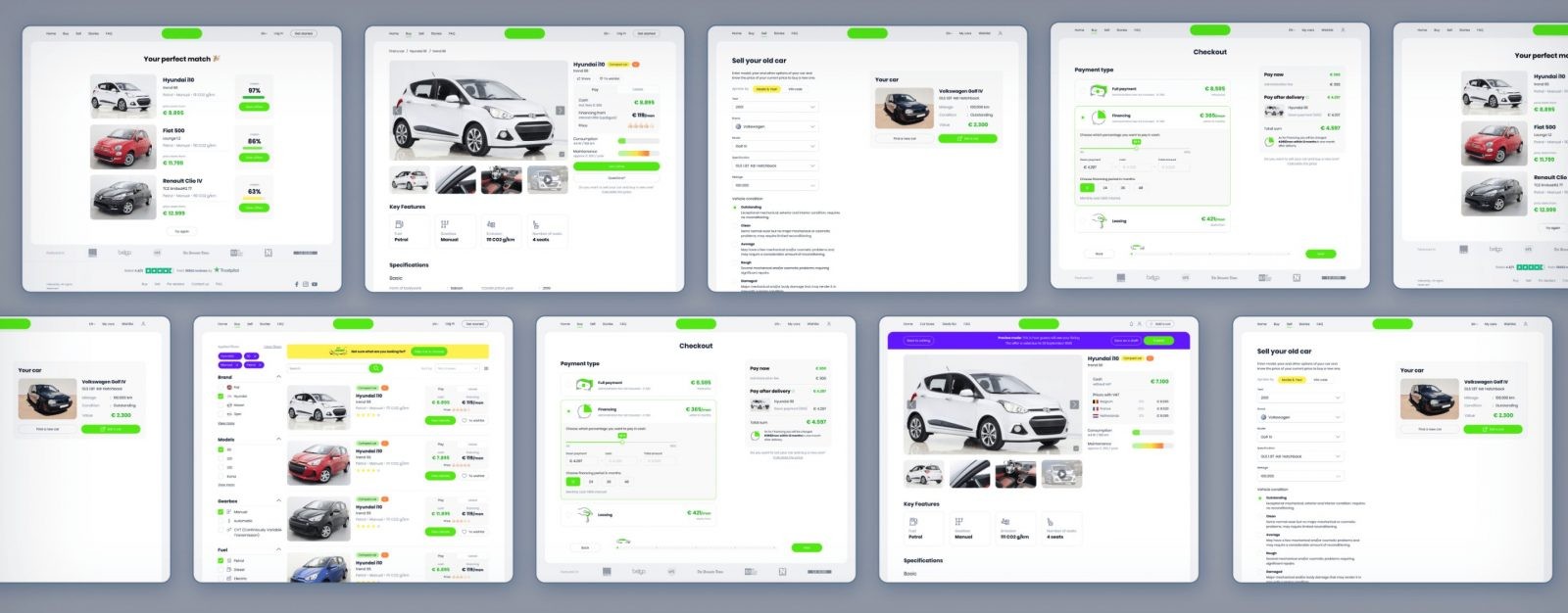
This is a high-class marketplace for buying and selling new and used cars. It seamlessly accommodates two distinct roles of sellers and buyers, ensuring a smooth and effortless user journey. To highlight brand identity we created a visually appealing and cohesive design.
TEAM
10 members
STARTED IN
2019
FINISHED IN
12 months
COUNTRY
Belgium
INDUSTRY
Automotive
OVERVIEW
About
the business
The Artkai team was requested to build a new online platform for buying and selling European vehicles. While there were many existing marketplaces, most had repeating issues: complicated and time-consuming search, frustrating information structure, and stressful relations with dealers for buyers.
The rise of the Internet produced powerful tools for shoppers, but most buyers still had to trudge down to a car lot. We were inspired to change the game by building a tool that would not follow outdated "best practices" but instead genuinely fit in customer needs, motivations, and behavior.
OVERVIEW
Project tasks
- Build a Marketplace with two separate roles of seller and buyer that would provide an effortless user journey
- Design a user experience that will help to reduce the time for purchasing a vehicle by covering user pain points
- Create a Visual Identity for the digital product with an offline presence
OVERVIEW
Project team
• 2 UI/UX designers
• 3 Full-stack engineers
• Solutions Architect
• DevOps
• Project manager
• Business analysts
• QA engineer
3
months for
research and design
14
months for
development and QA

TypeScript

Redux

Next.js

Vue

Vuex
Nest.Js

AWS

K8S

PostgresQL

REST

Swagger

Socket.io

GraphQL

Microservices
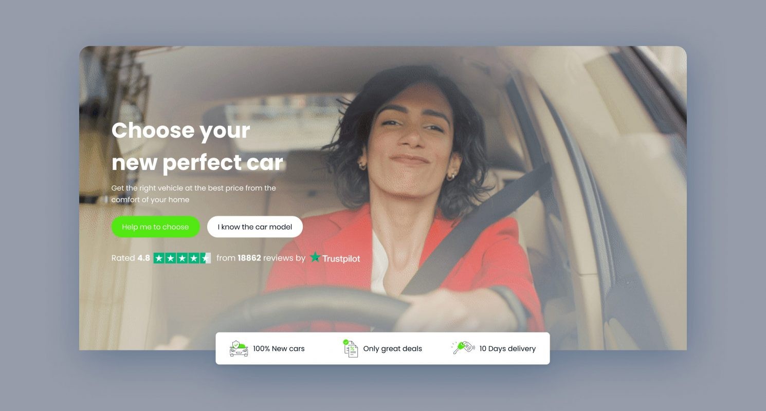
Choose your new perfect car.
PROJECT JOURNEY
Product idea
Before starting the design and development, our team studied the target audience from each angle. Obviously, we were building two separate user flows, but it was essential to consider not only practical requirements but also emotional aspects. For buyers, we wanted the platform to be welcoming and speak the language of an old friend. While for sellers, it was supposed to be a bit more formal; otherwise, too much playfulness would turn away from our solution.
As a result, each flow embodies a set of tailored stages based on user needs and expectations.
Car searching.
PROJECT JOURNEY
Buyers
functionality
After a series of interviews with people who recently bought cars, we determined that the process seemed confusing for many of them. Those who didn’t have a passion for the vehicles themselves struggled to choose brands and models and figure out technical aspects, like engine configuration or emission class. We decided to target our product to users who search for the most straightforward tool and appreciate friendly assistance along the process.
Questionary
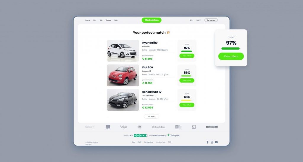
As a buyer enters the marketplace for the first time, there are two potential scenarios, whether one doesn’t have a clear vision about a car or has determined criteria for a search. We were interested in the first case since that was an area where we could help the most.
For those users, who didn’t know where to start, we designed a Questionary. It is presented as illustrated series of questions about the preferred gearbox or the number of people using a car.
Users get a list of recommended cars to look at in about four steps, which is a great starting point.
Search filter
Besides the standard set of markers like brand, year, fuel, etc., we added a distance to the car criteria. That was important since the marketplace assumed that cars could be purchased and delivered from different countries, which affected the final cost. Also, we knew that the payment information was one of the crucial factors for the shortlisting. That is why each preview card on a search page includes details about cash prices and lease options.
Product card
The interviews with the target audience helped us define the most common factors users consider while choosing cars. Surprisingly, most were based on abstract feelings rather than strict technical requirements. That determined our decision to use design to present information most humanly. Thus, we added car labels as "comfort" or "compact," letting sellers speak a familiar language. Also, the design helped us express each car's pros and cons through color markers, so it was intuitively clear for each user. At the same time, we kept all the standard details one expects on such marketplaces, such as specifications and user reviews on a particular model.
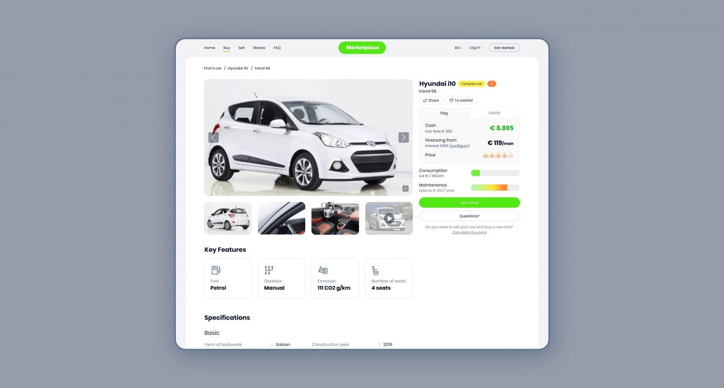
Car page.
PROJECT JOURNEY
Payment
Checkout
The payments for vehicles are happening through our marketplace. We put an extreme focus on providing the most transparent information on payments, excluding tricking fees that appear along the way.
The user is suggested to choose three payment options: full payment, financing, or leasing.
For the financing, we integrated a calculator that displays the total amount depending on the down payment and financing period.
Insurance
As insurance is mandatory for vehicle ownership, we presented users with three options Based on the coverage and its cost. For each type is accompanied by a short, clear description. The most appropriate option could be added to the total price at checkout.
Additional product & service
Taking care of users means anticipating their potential needs. Our marketplace contains a section with complimentary products and services that a new car owner can require. It starts with small products like car oil and ends with wheels, roof bar kits, and boxes. As our clients wanted to keep the marketplace's focus on vehicles, not car-related products, the section with such goods can be reached only during the checkout page.
Delivery
The marketplace provides buyers numerous options for delivering vehicles, like bringing a car to the indicated address, picking it up at the dealer center, or picking up a Hub. For each variant, we calculate the price based on such details as distance or dealer's terms.
Selling old car
Our goal is to maintain relationships with buyers after the purchase. So if, after a while, one decides to sell the car bought through the marketplace, we developed a quick switch to seller mode. Therefore there’s no need to fill in the car’s details over again; it’s kept in our system.
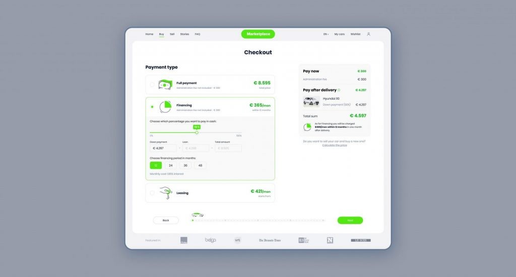
Payment methods.
PROJECT JOURNEY
Seller functionality
The success of any marketplace in some way is determined by the quantity and quality of propositions. Our goal was to provide a straightforward tool for car dealers, to easy their routine and help sell in a more convinient way.
Adding a car
The core functionality for sellers relates to adding a car to the marketplace. From the start, a user must add a VIN code, which helps validate a vehicle. Then we suggest filling in the fields that are helpful for a buyer to make a decision. This also includes adding photos, videos, and, optionally, legal documents. The seller can specify all essential details, including shipping countries, that reflect the car's cost, as VAT differs. Additionally, users can safely publish draft offers and set up their expiring dates.
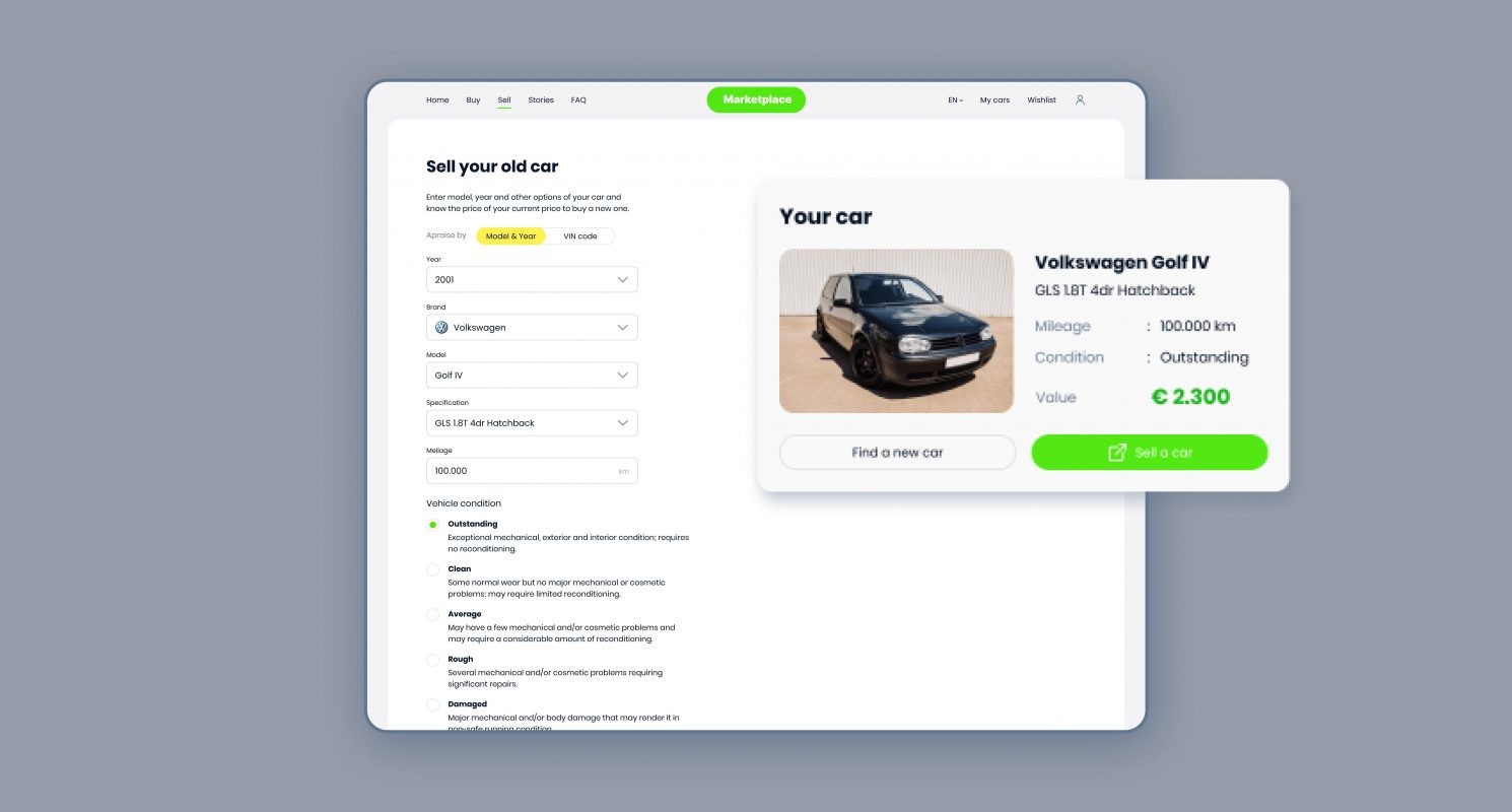
Sell a car.
PROJECT JOURNEY
Visual identity
The visual appearance can reflect the service idea the best. Our visual language was focused on simplicity can be traced in design materials: plain colors and a simple layout with a minimum of elements. As our team designed an easy, intuitive solution, we imagined it as sending a request - getting the result. From this perspective, a push-button is the first association that comes to mind. The simple and familiar thing to everyone is essential to many everyday actions. Matt Novak, in his article Push-button Promises, explores the cultural and social phenomenon of the push button the following way: "Whether it was for ringing doorbells, illuminating lamps hailing domestic servants, or turning on any number of new electrical appliances, the push button arrived in full force as an interface that was supposed to save time and generally make life easier."
We loved this idea and made a push-button an integral part of the online platform interface. It takes part in most interactions and alludes to the metaphor of pressing the button to start a car.
Colors
In users' minds, the green color is strongly associated with such definitions as a start, go, fresh, new, and approve. We chose the green shade that is vibrated by energy and optimism. Other picked colors enhance the positive, dynamic, and humanistic brand image.
Typeface
For the wordmark, we created a font that gives a feeling of movement: the circles are an allusion to the wheels and lines for roads. Poppins font was chosen as corporate because of its similar visual characteristics and broad capabilities like many styles and extended glyphs panel.
Patterns
Based on the logo's shape, we have created a range of seamless patterns to enrich the brand's visual communication.
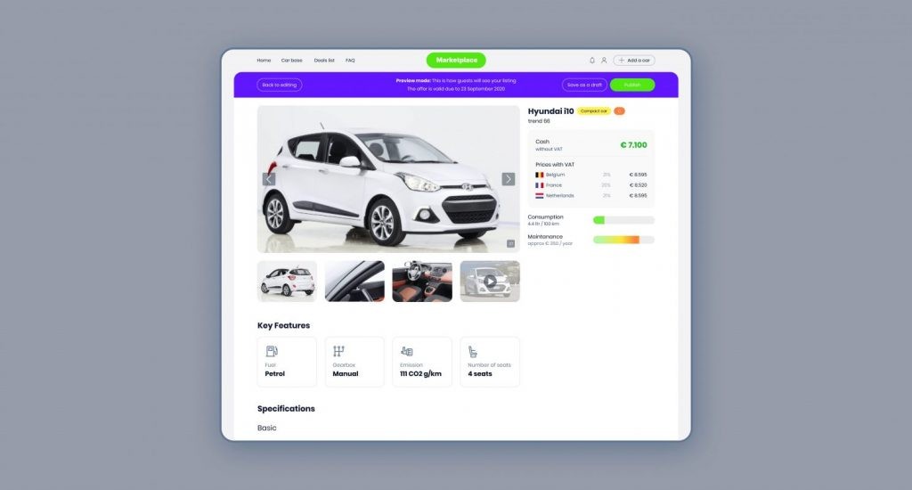
Add a car menu.
UI decisions that make sense
6 images
RESULTS
OUTCOME
After the launch, the marketplace quickly gained both types of users: sellers and buyers. With the promotional activity, our clients signed up some major car vendors, which helped us to fill the platform with exciting offers.
As we analyzed buyers' interactions with the platform, we were excited to see solid time spent on the website. That complimented our UX decisions. Another part that proved itself was a Questionary. We compare it to a robust icebreaker for users without formulated requests.
1 million
amount of payments through the marketplace per month
80+
car dealers across the Europe
Read More
Explore articles from Artkai - we have lots of stories to tell
Join us to do the best work of your life
Together we advance the human experience through design.