![Customer experience problems in online banking & How to fix them with UX [+Case study]](/_next/image?url=https%3A%2F%2Fapi.artkai.io%2Fwp-content%2Fuploads%2F2022%2F04%2Ftable.jpeg&w=1600&q=75)
Customer experience problems in online banking & How to fix them with UX [+Case study]
In digital banking, user experience (UX) from the interaction with a product has officially become the single defining aspect of the overall customer experience (CX).
If you want to improve customer experience metrics, we at Artkai suggest not rushing into expanding your customer support team or coming up with new appealing offers. Our 7-year experience working with banking and fintech companies suggests the reasons for customer dissatisfaction lay elsewhere.
Sure, every digital banking case has a unique set of CX problems discovered during more in-depth research. But ultimately, they all derive from poor performance in one or multiple areas of UX design expertise.
This article will break down how a human-centered UX approach can drastically improve the customer experience and reduce costs in the digital banking sphere. To illustrate it, we will use our case for ProCredit bank Georgia.
Table of contents:
Customer expectations from digital banking UX
Before we talk about specific customer experience problems, let's outline users' expectations from their digital banking experiences in 2023.
More and more, we're witnessing the "trivialization" of important human-centric interface attributes like usability, consistency, and frictionless user flow. It includes elements like quick interface navigation, easy sign-in & product filtering, consistent design, etc. If previously the simple lack of operational friction and consistent visual design were enough for banks to stand up among competition, now users expect it as a given part of the package.
However, both established and new banks still struggle with getting this necessary aspect of UX right. Their digital assets are outdated, buggy, inconsistent, or intricate, resulting in:
- poor customer reviews;
- silent decrease in sales and customer retention;
- lack of investments;
- increased load on the call center, and more.
Before the pandemic, many legacy banks with established reputations could easily survive the effects of poorly designed digital assets.
Now, online channels are not just complementary elements to offline branches anymore. They are the primary way people access their money and interact with banks. And the lack of a timely response to this shift has brutally affected many banks and their customer base.
As of banking UX trends, in 2023, customers expect digital banks to provide:
- Usability and consistent experience
- Complete transparency
- Frictionless onboarding
- Hyper-personalization of services
- Chatbots and virtual assistants
- Rewards and banking gamification
- Self-service portals
- Advising and assistance services
If your bank operates fully online, you must provide these (and more) attributes to your customers to encourage their loyalty and reduce the load on your employees.
UX research as a core of your optimization
In-depth research is the single most important step in your experience improvement strategy. Depending on the situation, research may include but not be limited by the following activities:
- Interviews with executives and stakeholders
- User research and analysis
- Competitive research
- Customer & staff behavior study
- Usability audit/testing
- Discovery workshop, etc.
UX research is the not-so-secret-weapon product development companies with a human-centric focus like Artkai use to improve customer experience. It is the only way to detect areas needing optimization/change the most.
For one bank, the reason for the poor CX can be found in the intricate interface and lack of crucial functionality; for another - bureaucracy and confusing onboarding, and so on.
Research reduces uncertainty and helps to allocate your resources cost-efficiently. It ensures that future product changes will have a maximum positive impact on your customer and business.
Research sets the direction for the whole project. You can't skip this step, and you shouldn't entrust dilettantes with it.
Now, let's talk about what areas we found problematic in our client's case and how we solved them, improving the customer experience.
Improving digital customer experience with UX: ProCredit bank story
After conducting in-depth research, we outlined four UX areas in the client's case that needed improvement:
- Usability (navigation, personalization, awareness)
- Consistency in design and functionality
- Workflow (user flow, onboarding, relevant support, control)
- Brand perception
These were the areas we focused our efforts on.
Find more details about the design process and solutions in the full ProCredit bank case.
1. Usability
Usability is what helps your customer to discover everything that can help them to get things done. The product's information architecture and navigation must speak the user's language and be intuitive and frictionless. It must ensure that users will discover all your product's features they might need for the class experience.
Poor usability makes a user wander around your website or app, struggling to complete the simplest task. It annoys them and decreases their trust in the system and, therefore, the brand.
In our case, after conducting multiple client interviews, we found out that 30% of the bank clients were unaware of the key online features, which is why they tended to turn to the bank's branches.
As for business users, 65% of them didn't know about the online features they stated were very important. They also visited the branches to solve something they could've solved online, had they known how to do it.
The pandemic has not only revealed but seriously escalated the problem. Branches couldn't function at full capacity, and people were in volumes contacting Customer Support to help them figure out the interface. It overwhelmed the bank's contact centers and required a quick fix.
Solutions:
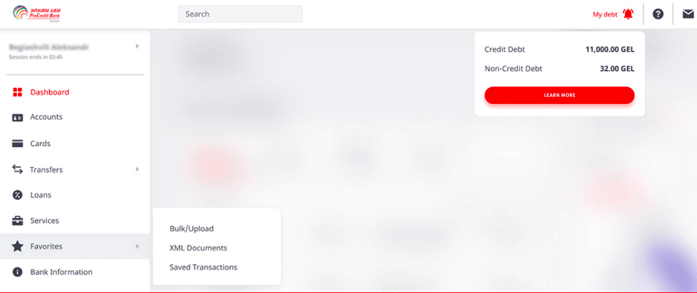
- Fast navigation
- Contextual information
- Favorite section

2. Consistency in design and functionality
Consistency in design means stylistic homogeneity across online channels - their colors, fonts, and layouts. Functional consistency means every digital channel the company owns - a mobile application, web internet banking, - provides a user with the same set of tools to reach their goals.
A consistent digital product interface looks predictable yet not lazy or dull. It has the same rules across all the pages, and this familiarity drastically reduces the tension and confusion.
It is crucial a user can perform similar tasks in similar ways. When a user lands on the home page, all other pages he visits should reflect the same design.
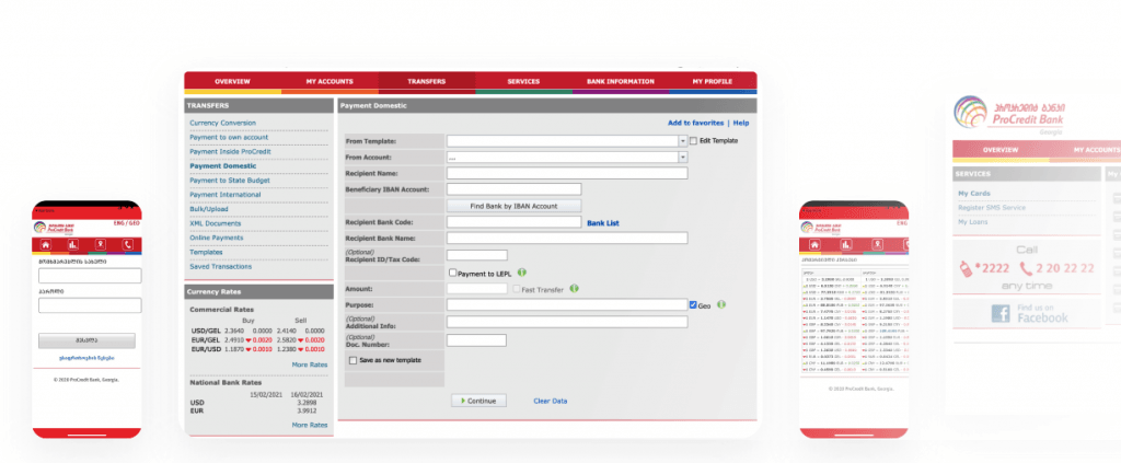
In our case, the UI of the client's digital and physical assets - web internet banking, mobile application, ATMs - was functionally and stylistically inconsistent. This fact confused and annoyed the bank's clients.
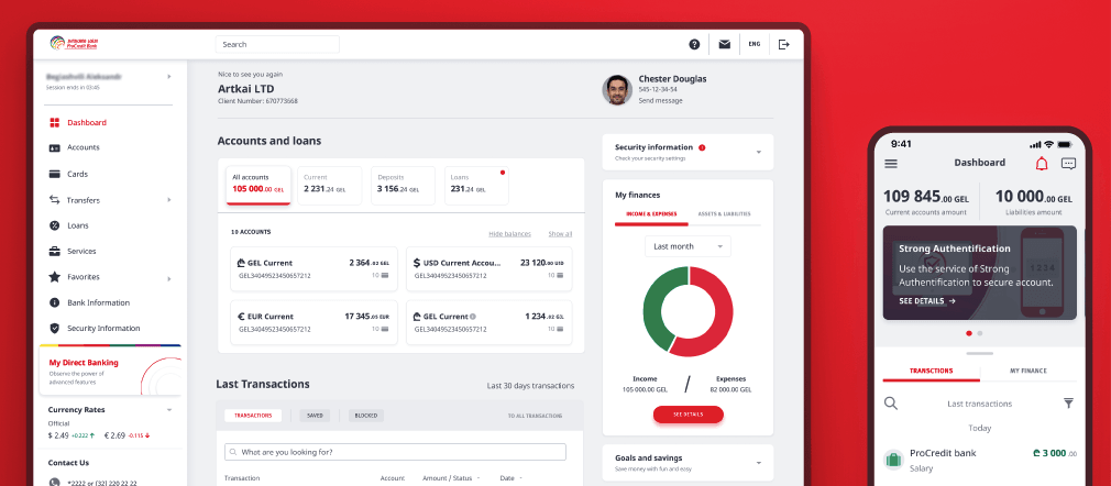
To fix that, we completely redone and refined the UX design, adding the lacking functionality. Plus, we developed a new Design System with reusable elements to speed up future product development and maintain stylistic and functional consistency across all bank's channels.
Bank's interface across different digital channels before the UX redesign:

Bank's interface after the UX redesign:

3. Workflow
Well-constructed workflow kills two birds with one stone. First, it makes customers' interaction with your product efficient, helping them to get the job done. As a result, they leave every interaction satisfied, more and more associating this feeling with your brand, which strengthens their loyalty.
The Customer Contact Council, a division of the Corporate Executive Board, conducted a study of more than 75,000 people: "Delighting customers doesn't build loyalty; reducing their effort—the work they must do to get their problem solved—does." (Harvard Business Review)
Second, efficient workflow boosts employee productivity and reduces costs (sometimes drastically) spent on Customer Support. Conversely, problematic workflow reduces the productivity of your employees while adding extra work with all the customers storming the contact center with requests.
Solving this problem was one of the main tasks given to us in the ProCredit bank case. Contact centers were overwhelmed with support calls, wasting personal assistances' time navigating customers through the interface. Instead, they could've been attracting new clients and providing financial consulting for the key customers.
Solutions:
- Friendly prompts
- Simplified mobile onboarding
- Fast automatized transfers and payments
4. Brand perception
A study on human-computer interaction revealed that people form their impression of a webpage within the first 17-50 milliseconds. The eye blinks in 300-400 milliseconds; it means your website will be judged faster than you can blink.
If you want your brand to be perceived as innovative, reliable, aesthetical, fun, etc., the only way to make this happen is through your digital channels.
You can't have an outdated-looking, confusing or dull website and expect to be perceived as an industry leader. It instantly puts users off and creates a strong negative emotional association with the brand and your offer.
But the good news is when we improve the previous three UX aspects of a business, brand perception improves automatically.
In the ProCredit bank's case, its digital channels didn't reflect its core values and the desired associations with innovation and transparency they wanted to evoke. Customer reviews compared the bank's website and app with Internet Explorer - not the association you want to evoke in such an innovative field overflown with competition from fintech businesses.
Our redesign positively impacted the bank's brand perception, which was reflected in positive customer reviews very soon after the redesign.
Here are the results in numbers:
- 99% of available banking services were digitized and can now be performed fully online;
- x1,5 faster to make a transfer via web or mobile banking;
- x2 faster login compared to the previous version;
- +60% faster to block a card via mobile application;
- Significant increase of positive feedback about the bank services.
Key Takeaways
- UX officially defines the digital customer experience in banking and other fintech services. In 2022, to improve the CX metrics like net promoter score, customer reviews, and others, investing in your product's UX is the only solution.
- UX research is the core of any CX optimization campaign and should be conducted by UX professionals. It will pinpoint all the challenges users experience interacting with your product, areas of potential growth and competitive edge, and more.
Need help creating outstanding customer experiences in fintech? Reach out to Artkai experts for a free consultation.
Clients and Results
Schedule your free consultation
Don't miss this opportunity to explore the best path for your product. We are ready to delve into the specifics of your project, providing you with expert insights and optimal solutions.
Book your free sessionRead More
Explore articles from Artkai - we have lots of stories to tell
Join us to do the best work of your life
Together we advance the human experience through design.