Artkai’s Visual Identity Synchronization
In 2025, Artkai celebrated its decade-long history, during which it has evolved through several strategic shifts. The current Artkai positioning required a new visual representation that enhances its appeal to major industry players and secures large, stable contracts in the IT sector.
Over the years, we have already had a few Artkai's visual identity tuning projects, and for this project, we considered all the challenges and changed the approach: instead of producing just another set of new visual elements, we concentrated all the project's activities based on two pillars:
1.
The project centered around three key domains where the Artkai brand identity is most visible: the website, presentations, and social media. From the first day, we worked only with real assets and polished each of them (sometimes, we literally could spend a day on one pitch deck slide until we reached a desirable result).
2.
The outcome must be a straightforward and user-friendly system that enables non-designers to easily work with brand materials.
The journey begins with an assessment of Artkai’s current visual identity, examining its coherence, key elements, and presence across communication channels.

After a detailed analysis, we identified three key brand identity challenges:
Lack of Consistency
Artkai’s visual assets are created by various departments and specialists at different levels, often without coordination or a long-term strategic approach. This results in an inconsistent brand presentation.
Insufficient Brand Elements
A strong brand requires a comprehensive visual identity kit, including a logo, typography, colors, illustrations, icons, and imagery. Currently, Artkai’s identity is largely limited to a wordmark-based logo and Inter font typography, while other visual elements remain inconsistent and ever-changing.
Weak Storytelling
Artkai’s visual identity lacks distinct storytelling and unique features, making it appear generic rather than memorable.
How to address these challenges:
- Provide ongoing support.
- Establish a cohesive and comprehensive set of essential brand elements.
- Create clear, detailed, and user-friendly guidelines.
- Design a complete suite of templates and assets to ensure consistency.
- Conduct workshops with inner teams involved in the production cycle.
How we approached brand identity refinement
Step One: Brand Elements
We started by revising the brand’s core visual elements to ensure consistency, recognition, and modern appeal. Our goal was to review and decide whether we need to change logos, colors, typography, and imagery to align with the brand’s evolving positioning while keeping its visual DNA intact.
Logo
The Artkai logo is now the only constant element of our brand identity. There are no reasons to update it, so we decided to move forward with other elements.

Colors
Artkai's basic palette consists of dark blue (#07142D) and pure white (#FFFFF), which remains constant in all of the brand's visual materials. However, when it comes to color balance and complementary colors, confusion begins. So, we reduced the number of colors and set clear rules for their use.

Typography
Artkai's current font was Inter, which perfectly fitted, but for the new vision, we proposed changing it to DM Sans. DM Sans has all the features that Inter has, but rounder shapes, softer curves, and a slightly more playful, “friendly” feel, allowing the font to serve as an additional trigger in shaping brand perception.

Inter

DM Sans
Imagery
Artkai didn't have a clear imagery system; its assets used many styles from different times in its decade-long history. So, we're focused on finding a new holistic approach for Artkai imagery that can be unique enough and easy to work with in the future. Our research showed that most relevant companies drift between abstract (gradients, concepts, etc.) and informative (examples of interfaces, office images, etc.) in their image approaches.
Both have pros and cons: abstractions give intrigue and engagement and better memorization, but don't give much information about the business, and an informative approach gives more information about the company, but doesn't give the same level of intrigue and engagement.

Another common pain point among modern tech brands is weak visual storytelling: around 252,000 new websites are created daily worldwide, most of which use ready-made visual solutions.

Around 252,000 new websites are created daily worldwide (Source: Forbes)
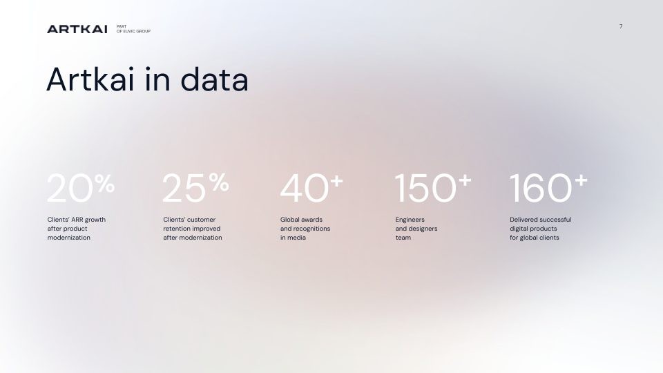
So, our task was to find a solution that would be simultaneously unique, informative, engaging, and approachable. Creative sessions gave us a solution: infographics. Using infographics as the brand’s main imagery makes Artkai more unique, engaging, and memorable. Infographics turn raw data into clear, engaging stories that are easy to follow. With a decade of experience, Artkai has plenty of data to share - the number of projects, countries, industries, awards, and more. Artkai can effectively utilize even broader industry statistics, which are numerous, ensuring the brand always has ample material for its visuals.

Examples of Infographics (Source: Pinterest)
Here are the numbers showing how effective infographics are:
- 12% Boost website traffic
- 61% of consumers find that infographics are the most effective way to help them retain information.
- 78% better for information retention.
- 178% Incorporating infographics into blogs and articles can significantly boost inbound external links.
Sources: Forbes, Infographic World, Visme, Xerox, Venngage.
When designing infographics for Artkai, we focused on a simple, minimalist style that can be easily adapted across platforms without losing its core look or message. This principle lets us create visuals that are both attractive and highly functional - supporting Artkai’s communication while making the brand more unique, engaging, and memorable.

Icons
Artkai uses icons widely, but - like its imagery - there wasn’t a cohesive style. We redesigned the set: the new Artkai icons are minimalist and strictly geometric, reinforcing a modern, tech-forward, business-oriented image without drawing undue attention to themselves.
Step Two: Brand Channels
After refining the brand’s visual foundation, our next challenge was to ensure that Artkai’s identity worked seamlessly across all communication channels. Presentations, social media, and the website are the face of the brand - yet before the redesign, each of them looked and felt different. Our task was to bring consistency and clarity. Here is how we achieved this:
Presentation
Presentation is one of the most demanded elements of the Artkai brand identity - all sales processes are built on it, so its importance cannot be overestimated. At the same time, it is one of the most problematic channels. With diverse content and tight deadlines, managers often design slides themselves and reuse old ones, leading to inconsistent styles and lower visual quality. So our task was not so much to make a beautiful design, but a design that withstands the agency’s fast, turbulent workflow.
To solve this:
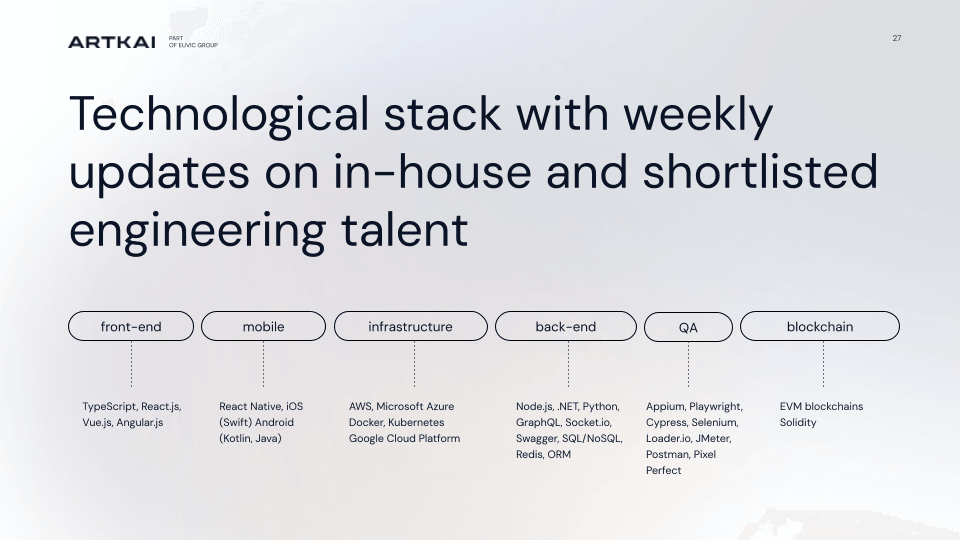
- We created layout grids. All slides have clear and convenient grids from one to six.
- The layout structure is simplified as much as possible: all content is aligned to the left edge, and the number of font styles and colors is minimized.

The next step was to create designs for all the main slides to work out all the possible patterns. At this stage, we really tested each slide until we were satisfied with the result.


Working with slides, we tried to anticipate possible challenges as much as possible. For example, for the "Our Team" slides, we always need photos of employees, but because Artkai is a completely remote company, it was impossible to get a satisfactory result. The solution was to use employees’ LinkedIn profile photos - something everyone already has. This also lets us link each image to the person’s LinkedIn profile, so potential clients can learn more about the specialist with one click.

We have built the same clear and convenient system for presenting Case Studies. The simple approach differentiates each case but corresponds to Artkai's general visual style.

The source files are easy to convert for each case. One of the gradient colors is Artkai's primary Deep Blue - the second selected from the case color. The screens are changed in smart objects. The files are in Photoshop, but they can be converted to Figma.

Cover sets are available for different types of cases: desktop only, desktop and mobile phone, and mobile phone only.
Presentation Guidelines
To support the presentation templates, we created clear, detailed guidelines that make brand materials easier to use and protect their integrity. We also ran workshops for the internal teams who work with these materials, explaining the workflows and answering questions.

Social Media
Artkai is active on Instagram, Facebook, and LinkedIn, but its visual identity feels inconsistent due to missing essentials: clear brand guidelines, a defined set of layouts, convenient templates, smooth handoff/communication around assets, and a complete library of brand elements.
To overcome the chaos, we developed all the necessary layouts. As in the case of the presentation, the layout structure allows even non-specialists to work with them: the content is arranged in a single column on the left edge, the number of font styles and colors is minimized, and enough free space is left for large amounts of text.
Site
Work has begun on redesigning the Artkai website in accordance with the new visual identity. Due to the large amount of content, the redesign will take much longer and will be completed gradually.

Step Three: Delivery & Enablement
To ensure that new designs last a long time and Artkai's visual communication remains coherent and attractive, we implemented the following steps:
- developed detailed and understandable guides;
- created convenient templates;
- held workshops with everyone involved in the processes;
- provided design support.
Outcomes
The project delivered three tangible gains:
- Consistency across touchpoints - one brand, many channels.
- Everyday practicality - non-designers can ship on-brand assets with confidence.
- A distinctive, modern, and conscious image - positioning Artkai as a trusted partner for major IT clients.
Why This Worked
- Focus on a few real high-impact domains first (presentations, social, website).
- Creation of all necessary brand elements.
- Simple design structures.
- Thoughtful templates.
- Enablement - guidelines and workshops - so quality saves beyond the design team.
Wrapping up
By focusing on what truly mattered - consistency, clarity, and usability - we built a visual identity system that works not only for designers but for the entire company. The result is a brand that communicates confidently to clients and scales effortlessly across every touchpoint.
If you’re tackling a similar challenge—one brand with too many channels and contributors - we’re happy to help. Check out our “BrandSync” workframe and connect with us. We provide first-class brand identity services.
Clients and Results
Schedule your free consultation
Don't miss this opportunity to explore the best path for your product. We are ready to delve into the specifics of your project, providing you with expert insights and optimal solutions.
Book your free sessionRead More
Explore articles from Artkai - we have lots of stories to tell
Join us to do the best work of your life
Together we advance the human experience through design.