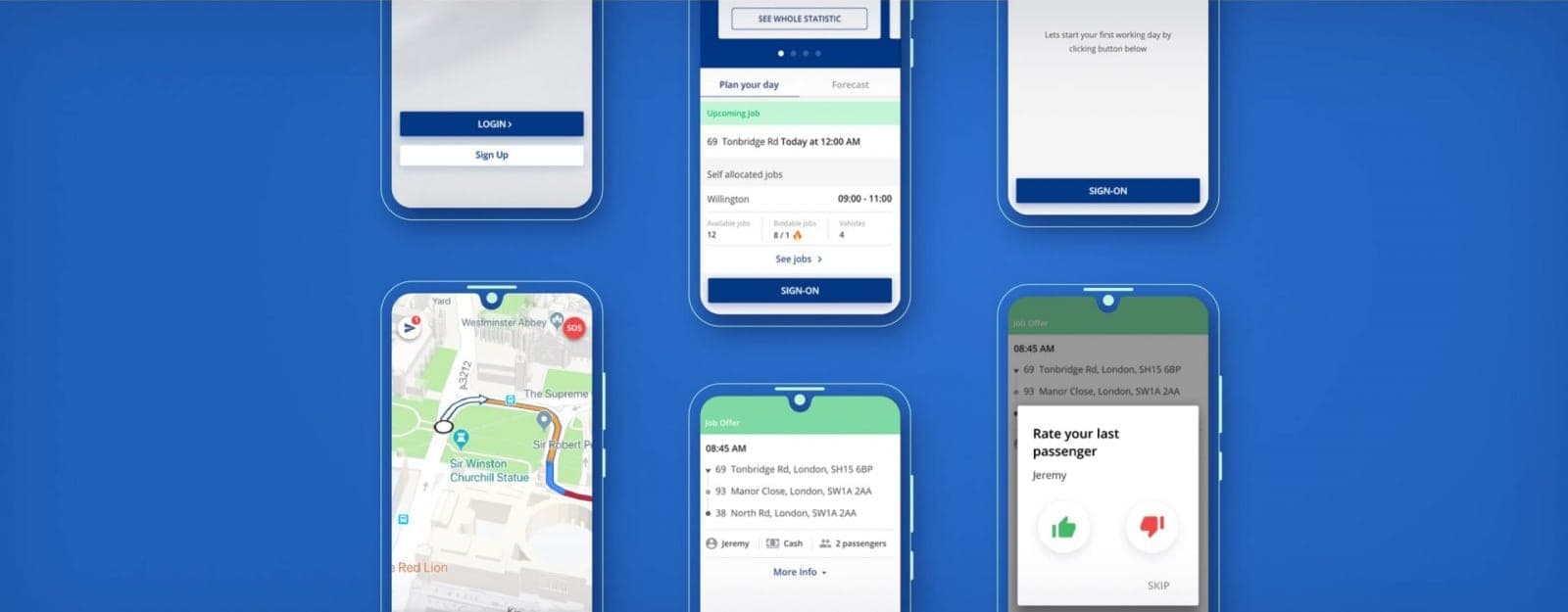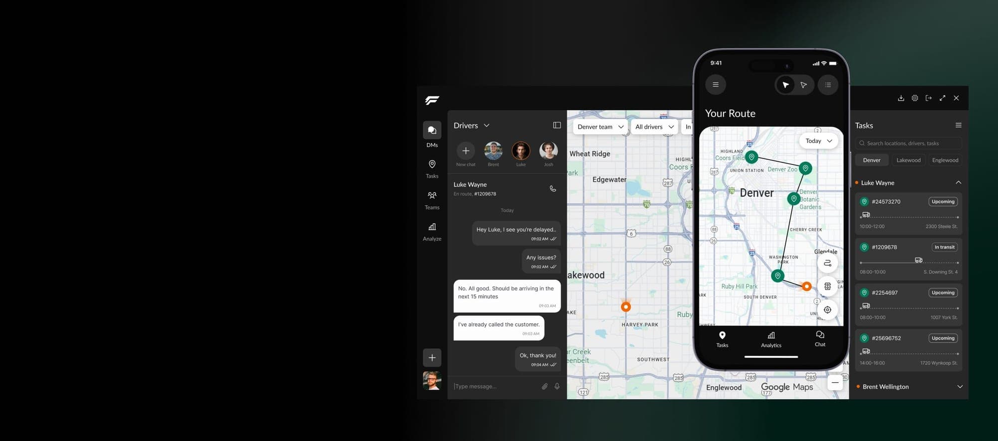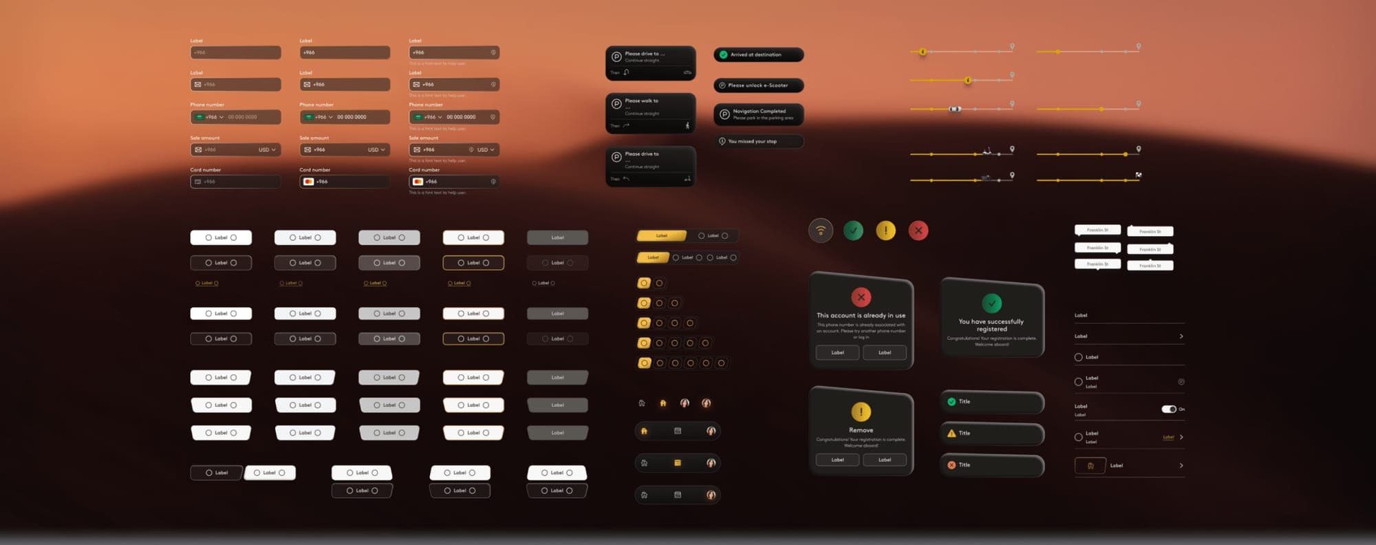
The full case study
Design system for an urban mobility app, step by step
On this page · 13 sections
About the business
The client, ‘Future City’ a visionary city from the Middle East, aimed to develop a robust Design System to streamline and standardize the rapid development of both internal and external applications related to all kinds of urban mobility, including (but not limited to) taxis, subways, buses, journey planners and delivery apps. The Design System should help to ensure seamless, cohesive experiences across the entire transportation ecosystem.
Project tasks
- Build a library of reusable UI components in light and dark themes for land mobility applications across the Future City ecosystem, to be used by different vendors.
- Define the Design System’s visual language (colors, fonts) in a central style guide.
- Integrate accessibility features (screen reader compatibility, high contrast) for all UI components.
- Prepare Documentation (component usage, styles, accessibility) for clear developer handoff.
- Design the CRM for easy access to Design System documentation.
- Design for future growth by creating a flexible system that adapts to new app features.
Inspiration
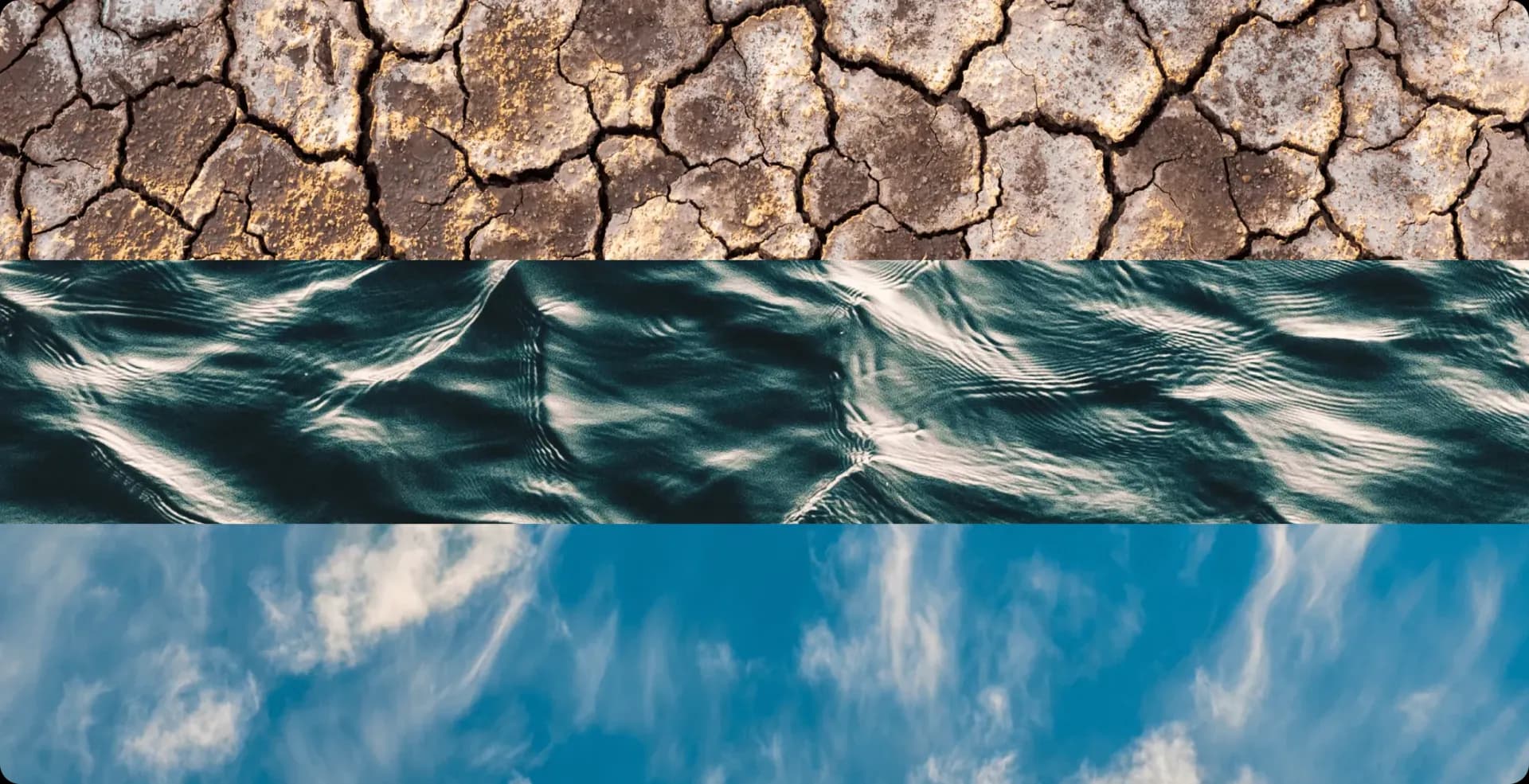
Nature served as a wellspring of inspiration for the design team. The lush green landscapes, clear blue skies, and vibrant coral reefs of Saudi Arabia heavily influenced our choices. This connection to nature is reflected in the use of natural gradients and organic shapes throughout the design system.
We were inspired by the endless green gardens, the clear light blue sky, the scorching hot sun, and the deep sea with coral reefs. The concept of natural gradients guided us throughout the conceptualization process, which we will discuss later.
Early Concepts
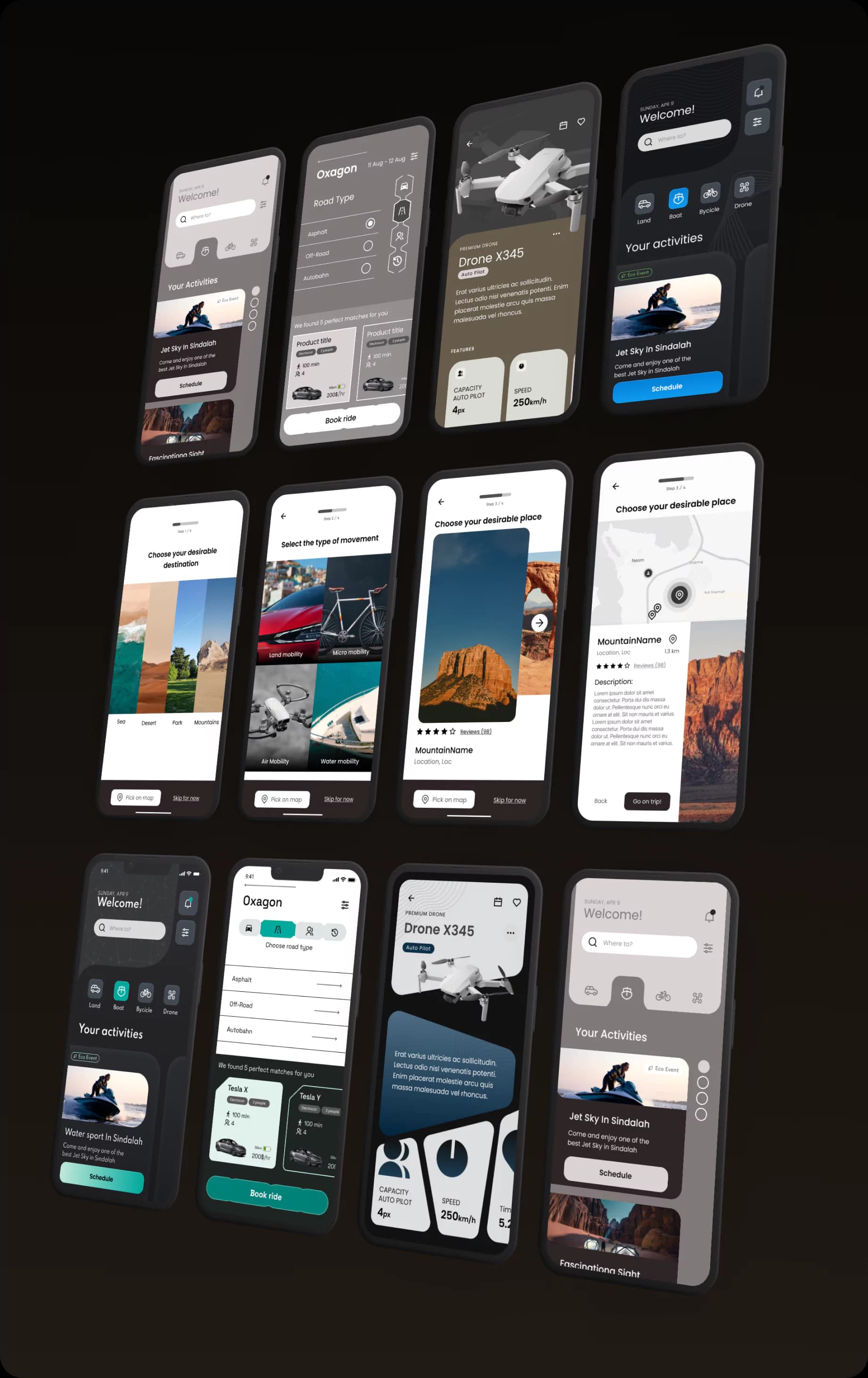
In our search for the perfect design direction, our team embarked on an exploratory journey, testing out various design concepts like liquid design, skeuomorphism, and irregular shapes. Picture us as adventurers navigating through uncharted territories, each concept serving as a different path to explore.
As we discussed and debated, our goal remained clear: find a style that’s both innovative and easy for users to grasp. It was like finding the sweet spot where creativity meets practicality.
Design System features
Tokenized design system
Efficiently manages design properties for consistency and flexibility across the system.
Slanted shapes
Adds dynamic visual elements for a futuristic aesthetic in components.
Light/Dark Theme
Offers optimal readability with contrasting colors for both light and dark themes.
Various styles
Encompasses diverse styles, including slanted, gradient, and innovative designs.
Unique style
Crafted to evoke futurism with innovative designs for an unparalleled user experience.
Accessive design
Prioritizes inclusivity and usability through extensive research and testing for diverse user needs.
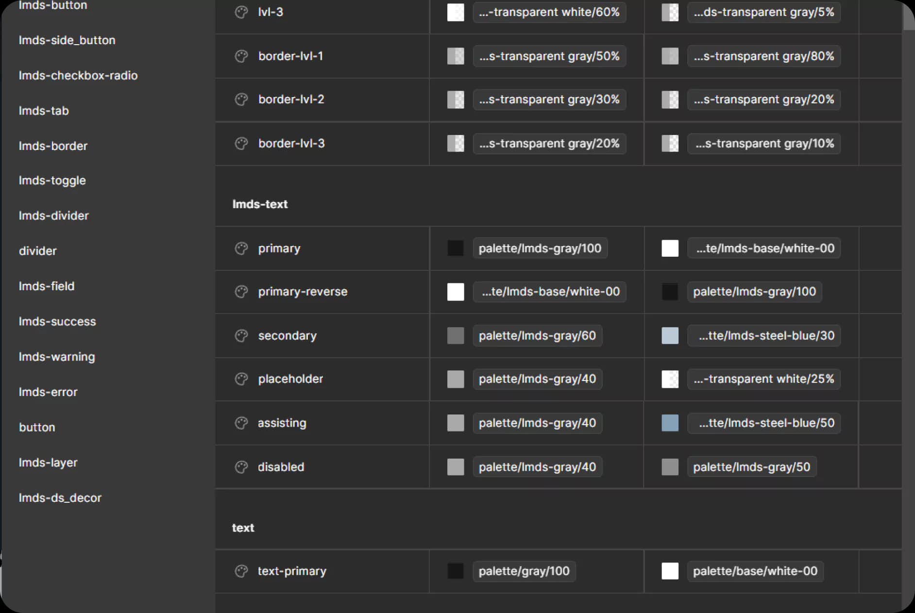
Tokenized design system
Efficiently managing design properties for consistency and flexibility across the system. Our tokenized design system serves as a centralized repository for all design elements, from colors and typography to spacing and layout. By defining these properties as tokens, we ensure that any changes made to the design system automatically propagate throughout the entire application, guaranteeing a cohesive and harmonious user experience.
Key features include:
- Centralized management of design properties
- Simplified customization through named tokens
- Streamlined collaboration with developers
- Seamless integration with Figma workflow
- Scalable design updates across multiple projects
- Enhanced design consistency and brand cohesion
Slanted Shapes
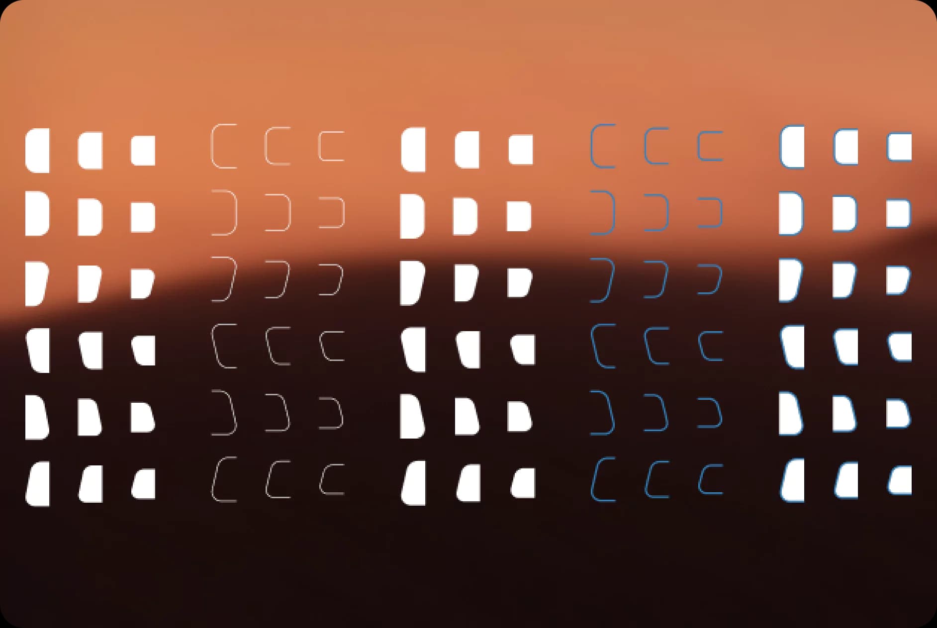
Incorporating dynamic visual elements for a futuristic aesthetic in components. Our design system embraces slanted shapes as a key design motif, infusing buttons, modals, and cards with a sense of dynamism and innovation. By utilizing slanted shapes strategically, we create a visually striking interface that reflects the forward-thinking ethos of Future City.
Key features include:
- Unique geometric shapes for buttons, modals, and cards
- Enhanced visual appeal and engagement
- Consistent application of slanted design across UI elements
- Flexible customization for different screen sizes
- Seamless integration with other design styles
- Unified design language for a cohesive user experience
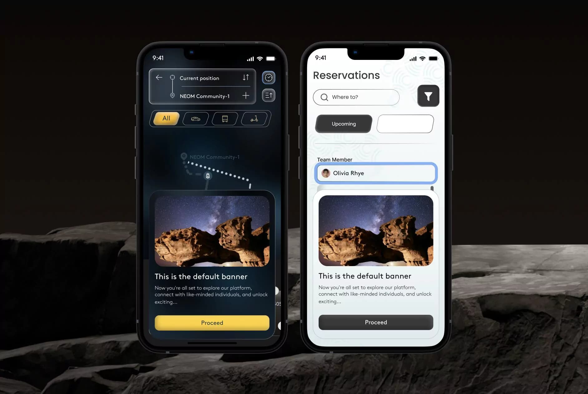
Light and Dark Themes
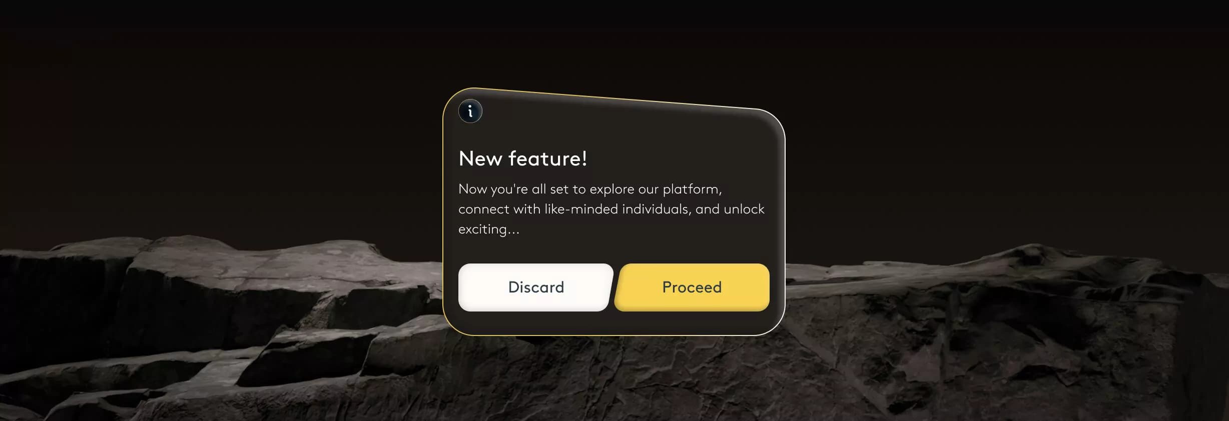
Offering optimal readability with contrasting colors for both light and dark themes. Our design system includes meticulously crafted light and dark themes, each optimized for readability and visual comfort. The light theme features a balanced color palette with blue or black as the primary color, while the dark theme adopts a striking gold hue, ensuring clarity and contrast in any lighting condition.
Key features include:
- Tailored color schemes for light and dark modes
- High contrast for improved legibility
- Consistent color hierarchy for clarity
- Accessibility-focused design considerations
- Adaptive color transitions for seamless switching
- Enhanced user comfort and engagement
Visual language
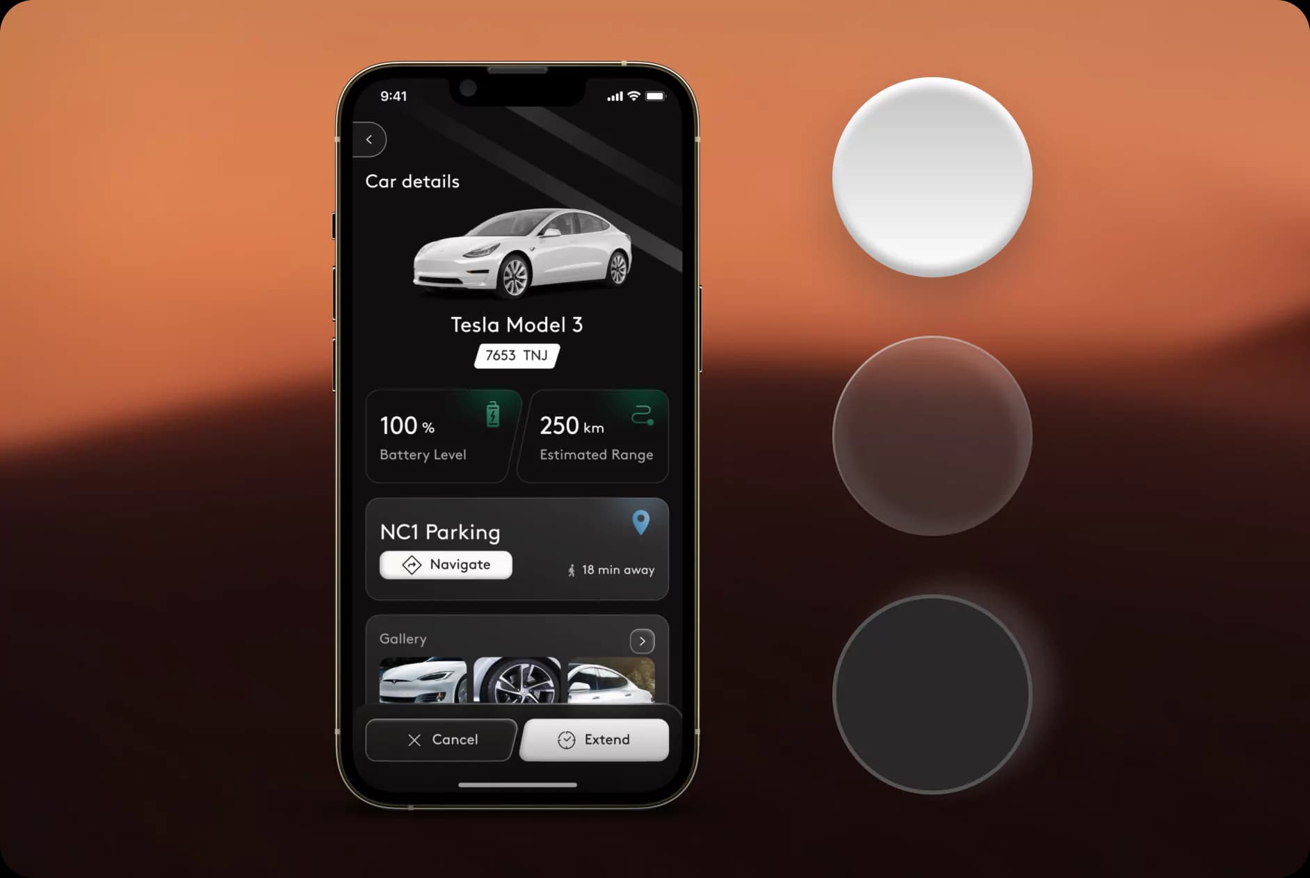
Encompassing diverse styles, including slanted, gradient, and innovative designs. Our design system offers a rich variety of styles to suit different aesthetic preferences and design requirements. From slanted shapes and gradients to innovative design trends like glassmorphism and skeuomorphism, our versatile styles empower designers to create engaging and visually compelling user interfaces.
Key features include:
- Versatile design options for different visual aesthetics
- Creative use of gradient effects for depth and dimension
- Integration of innovative design trends like glassmorphism
- Seamless customization for brand-specific requirements
- Engaging visual experiences for users
Unique Style
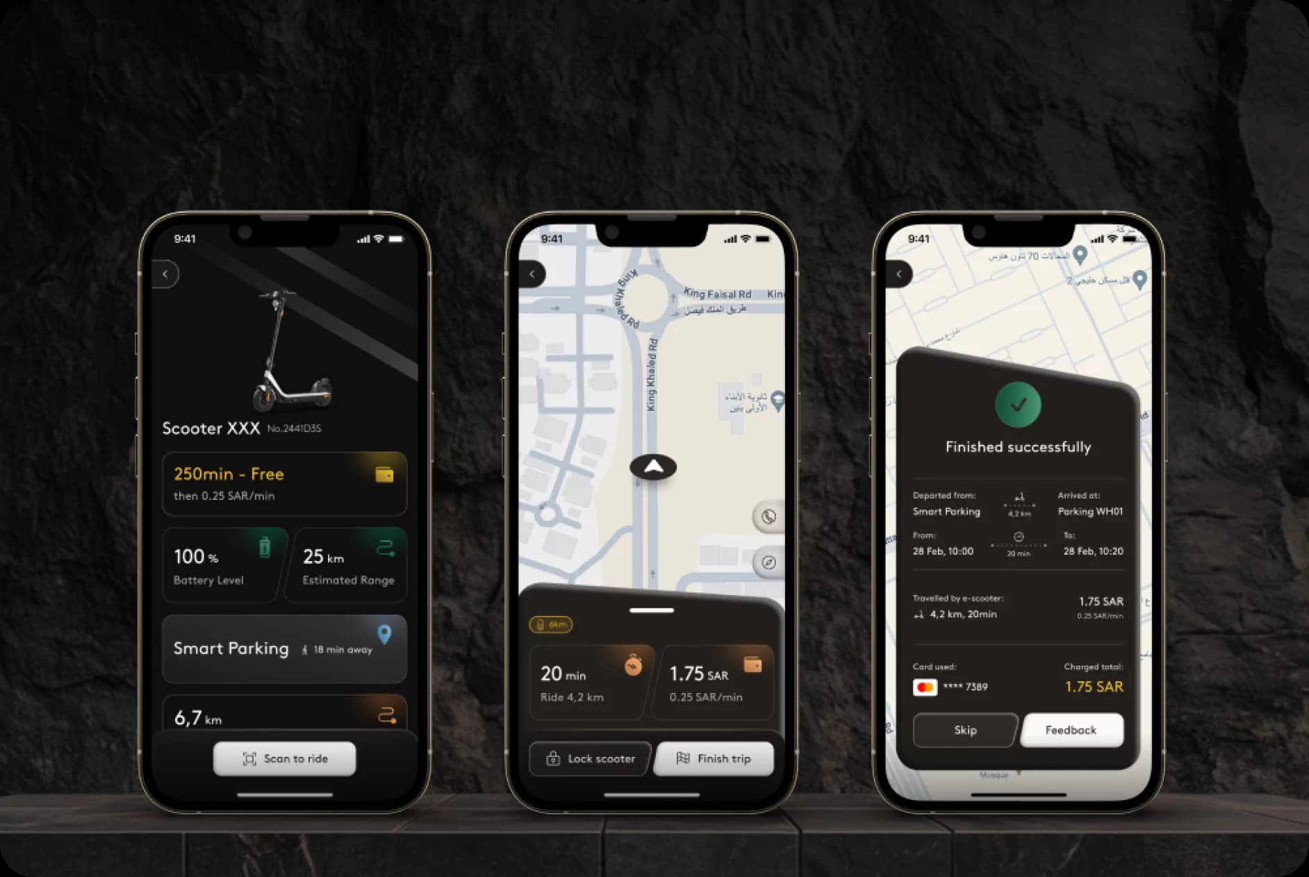
Crafted to evoke futurism, with innovative designs for an unparalleled user experience. Our design system is characterized by its bold and futuristic aesthetic, featuring unconventional shapes, patterns, and visual elements. By pushing the boundaries of traditional design, we create interfaces that captivate users’ imaginations and leave a lasting impression.
Key features include:
- Futuristic design elements for a distinctive visual identity
- Integration of cutting-edge design trends
- Consistent application of futuristic aesthetics across components
- Enhanced user engagement and brand recognition
- Differentiated design language for competitive advantage
Accessible Design
Prioritizing inclusivity and usability through extensive research and testing for diverse user needs. Our design system places a strong emphasis on accessibility, ensuring that interfaces are usable by all users, regardless of their abilities or limitations. Through rigorous research and testing, we identify and address potential barriers to access, creating interfaces that are inclusive, user-friendly, and accessible to everyone.
Key features include:
- Inclusive design considerations for users with disabilities
- User-friendly interface elements for intuitive navigation
- Accessibility-focused color contrast and font size choices
- Compatibility with assistive technologies like screen readers
- Optimized usability under various environmental conditions
- Enhanced user satisfaction and loyalty through inclusive design practices
Idea Testing
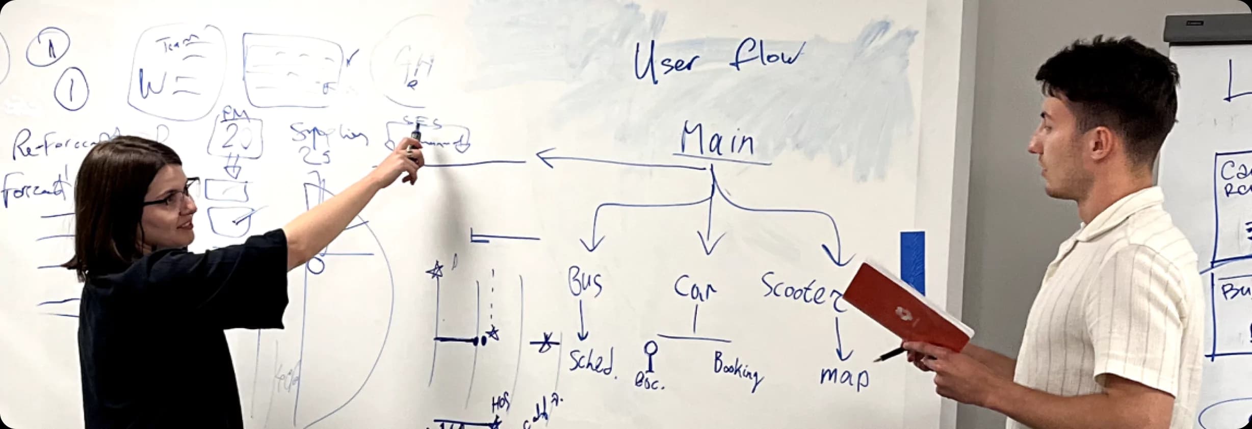
Our team traveled to Future City in Saudi Arabia to conduct thorough idea testing for the mobility application. Working closely with stakeholders and international collaborators, we engaged in brainstorming sessions and tested various user scenarios. We utilized Future City’s unique environment as inspiration, incorporating slanted shapes and futuristic styles into our designs to match the city’s innovative vision.
Our days were spent brainstorming ideas and crafting user scenarios to ensure our designs aligned with Future City’s ethos. We worked diligently, analyzing feedback and conducting user tests across different locations within Future City, from its bustling city streets to its tranquil waterfronts. Our goal was to gather insights that would inform our design decisions and enhance the user experience.
Through collaborative efforts and dedicated work, we developed a user experience that exceeded expectations, reflecting the innovation and progress synonymous with Future City. Our journey through idea testing was instrumental in shaping the future of urban mobility in Future City and establishing lasting connections with stakeholders and collaborators.
Outcome
With our carefully crafted design system in place, our client smoothly moved into the development phase, armed with a framework perfectly suited to Saudi Arabia’s user needs.
Benefits for our Client on final deliverables include:
- Consistency: Ensures a unified look and feel across multiple platforms and pages.
- Efficiency: Speeds up design and development by using reusable components, reducing redundancy.
- Collaboration: Enhances communication between teams, ensuring everyone works with the same guidelines.
- Scalability: Allows design and development to scale more easily with a standardized system in place.
- Quality: Promotes higher quality and consistency in the user interface by adhering to shared principles and practices.
- Cost-saving: Reduces long-term design and development costs through reuse of established components and patterns.
- One source of truth: Design System CRM allowed us to document every component, interaction and use case allowing all teams to stay on the same page and speed up the onboarding of new team members.