The full case study
DNA Payments, step by step
On this page · 12 sections
About the business
DNA Payments Group is one of the largest independent, fully vertically integrated omnichannel payments companies in the UK and EU. Founded in 2018, it is helping over 65,000 merchants with its cutting-edge solutions for online, in-store, and on-the-go businesses. DNA Payments Group includes nine companies: DNA Payments, 123Send, Optomany, Active Payments, EFT Solutions, Kwalitas, FPMS, Card Cutters, and Zash. Their offices are in London, Kent, Hull, Manchester, and Oxford, not to mention remote and field teams.
DNA Payments reached out Artkai team with a request to transform their existing portal. The objective was a fundamental redesign to make the portal convenient for existing users and attractive to new ones, allowing businesses to evolve and increase their income.
The Artkai team was enlisted to create a sophisticated booking platform from the ground up, encompassing additional tools to help cover all operational and marketing sides of things. The resulting product was aimed to be a stunning fusion of our technical expertise and clients’ extensive industry knowledge.
Project tasks
- Create the onboarding process, making acquaintance with the product quick, easy, and straightforward for the users
- Build a mobile version of the platform to prevent users from being attached to their laptops at crucial moments
- Redesign the current platform and build the missing points to provide a seamless user experience across desktop and mobile devices
Project team
- iOS engineer
- Android engineer
- 2 Front-end engineers
- 2 QA engineers
- Project manager
- Business analyst
4 months for research and design
6 months for development and QA
Redesign requirements
DNA Payments is the payments acquirer that provides online and face-to-face payment solutions to merchants. It enables users to carry out payment operations, makes the charging and refunding of money, and tracks the statistic.
While the platform potentially had all the necessary functionality a user could dream of, the product interface was confusing, causing low user involvement. The core UX of the portal was quite complicated. After initial analysis, our team found inconsistency in a design element, which explained why some users considered the service tricky. The lack of a mobile version of the site worsened the situation as users had to be tied to their laptops at a critical moment.
To start the improvements, our team defined the following project steps:
- Desk research for getting familiar with the project, understand the project field
- Key stakeholders interviews to gain deeper insights about the portal, and business, understand the everyday use cases
- Audit of the current product to define a list of crucial usability problems in the current interface
- Personas creation to empathize with users
- Customer Journey Mapping to work with key user interactions with the interface
- Backlog Preparation & Prioritization to make a large amount of work well-structured and clear
New Onboarding process
While our team had the complex task of transforming the product, DNA Payments prioritized for us to redesign the onboarding process and registration flow. Their previous onboarding harmed the user experience and impeded customer acquisition. We had to uncover the issues related to Sign In & Sign Up processes and fix them in the first place.
During the initial research, we discovered several ways where the existing app design was confusing. Starting from the landing page, the users had challenges choosing a price plan, finding necessary items, and later working with data tables and filters. The registration process took a couple of days – from selecting a price plan to setting up an account and making a payment. In contrast, Stripe took only 3 minutes to get on board. Also, the Login and Sign Up pages had a different appearance and design, which caused confusion and weakened the brand image.
UI design
The first general thing to transform the onboarding was creating a new and consistent UI design across all the pages that reflected the company’s brand identity.
Authorization stepper
The next major step was adding a wizard progress tracker, so users could see where they stood and how many steps they had left to finish. Before, after the initial registration, users had to pass a complex authorization process. The platform’s administrator checked the documents and could ask additional questions if there were any issues. For each user, the processing time differed and sometimes could feel messy. We designed the authorization stepper that provided users with transparent authorization status and the ability to exchange documents required for authorization within the portal. This gave new prospective customers a sense of advancement and reduced anxiety.
Explaining roles
We added a separate option to register an account as a Sole Trader (Sole Proprietor) and explained what different services users would get if they registered as a Limited Liability Company. This removed the ambiguity.
Postpone Registration
Adding Postpone Registration option allowed users to pause their registration and save all the information entered earlier so they could return later and pick up where they left off.
Product Selection
At the same time, we removed the Product Selection step from the registration flow and placed it on the landing page. This preceded the registration and made more sense because users get confused when choosing a tariff plan while setting up their accounts. These are two separate actions that require different thought processes.
After reducing the number of fields to only those necessary, it significantly shortened and simplified the whole process and significantly improved users’ engagement with the platform.
Merchant Portal
The project goal is a concise statement that outlines the specific outcome or result that a project is intended to achieve.
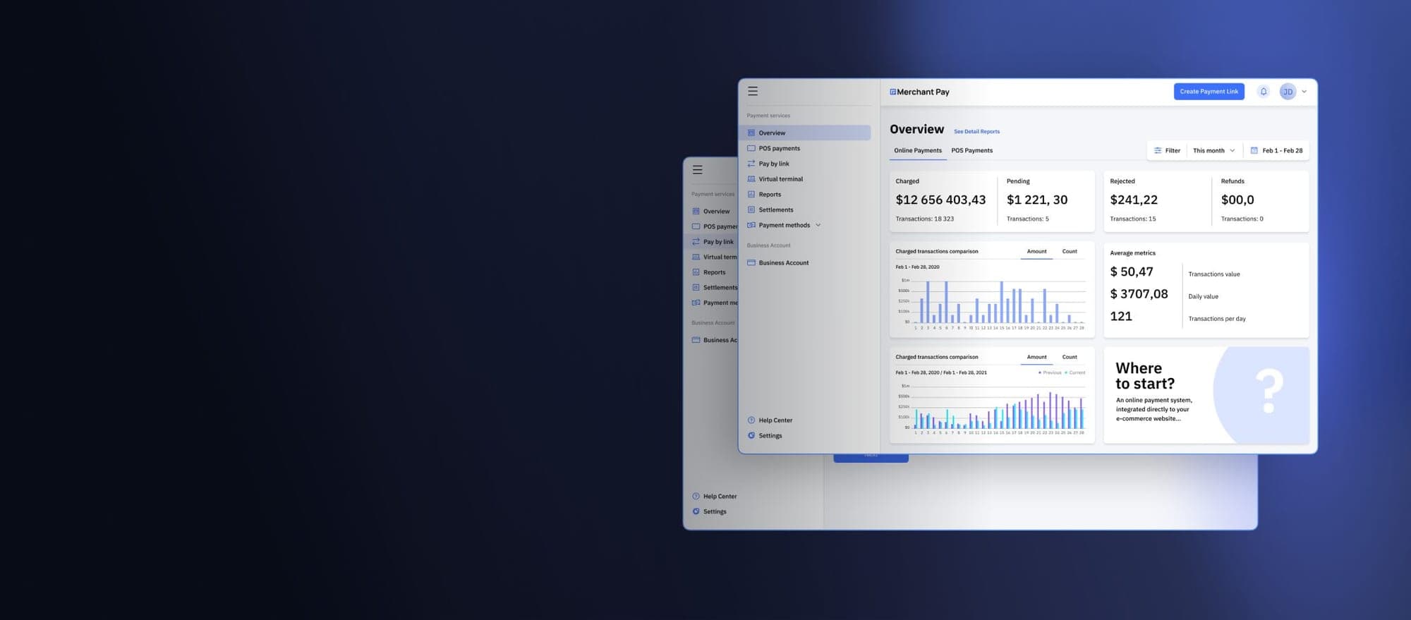
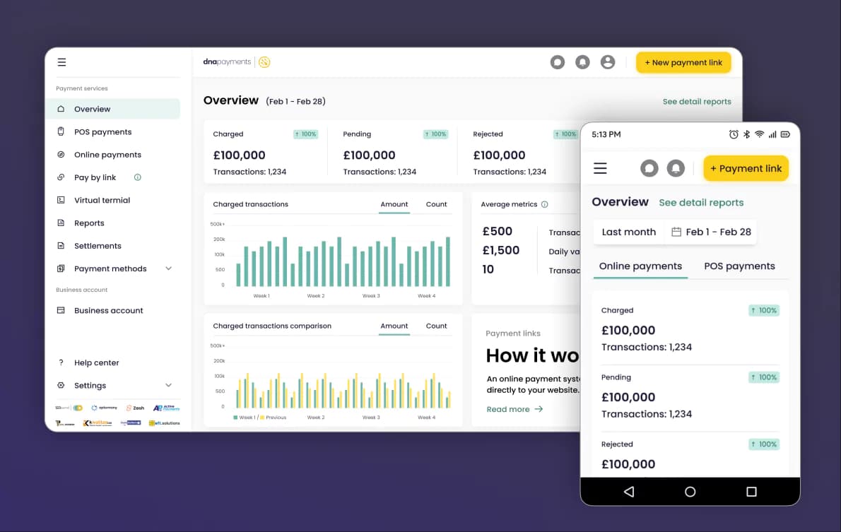
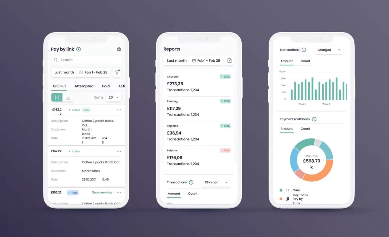
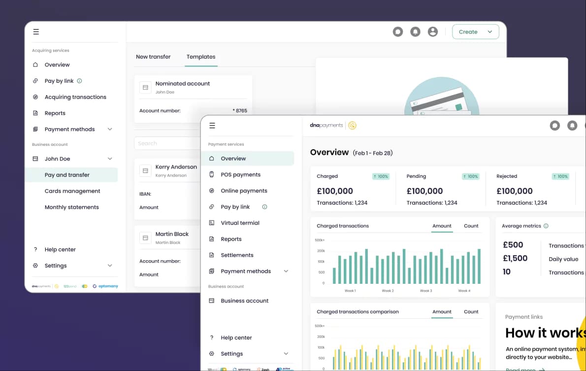
Merchant Portal provides real-time updates for each processed payment. Users can monitor, track, and manage Workflow, Transactions, Refunds, and Settlements. It’s the heart and soul of the platform, so we were highly attentive to providing users the ability to use this functionality to its fullest potential.
Merchant Portal’s features include:
- Merchant Portal Access
- Monitoring payments
- Managing payments
- Settlements
- Payment links
- Virtual terminal
- Dashboard
- Payment methods management
- Online chat support
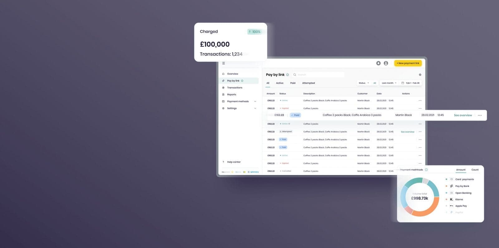
We allowed users to monitor and manage their costs through Online Payments or POS Payments, depending on their solution. We defined the portal’s two main functionality branches as Pay by Link and Transactions. Depending on the tariff that users selected, they had the ability to use both of them or accept payments only with Pay by Link. We deliberately redesigned the form where users create and interact with the payment link, allowing it easier to interact with this functionality.
Pay by link
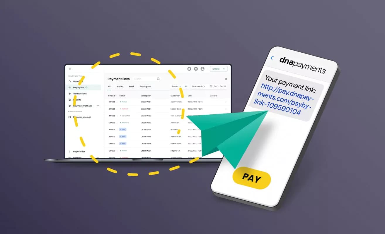
Payment Links let users accept payments online without using a website. This solution was especially vital for small businesses that couldn’t afford extra expenses for website development at a particular stage.
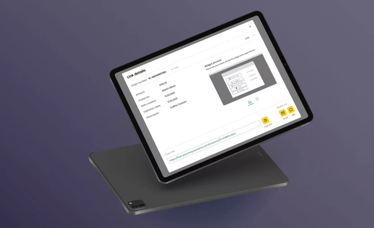
Once activated, users log in to Merchant Portal to create and send a Payment Link to their customers. As soon as the link is sent, users get paid in real-time. We connected major cards, Apple Pay, Google Pay, PayPal, and other payment methods to be accepted via Payment Links 24/7. Payment Links were automatically available on Merchant Portal if users requested that the solution and application form for Payment Links be approved.
Virtual Terminal
The idea behind Virtual Terminal was to provide a perfect solution for any type of remote business. Users can accept seamless, quick, and secure Online Payments through digital devices like laptops or phones. Additionally, users can easily send electronic sales receipts to customers for goods or services paid online after a successful transaction.
Payment methods management
Our team integrated the best payment methods in the sector, such as Apple Pay, PayPal, and Klarna, to ensure businesses have everything in place to provide quick, secure, and easy payments. No matter what scenario customers prefer — spreading the cost of an item or paying using a mobile device, our solution provides a seamless buying experience.
Online chat support
Business reports
Each platform related to payments without fail should have a Reports section. In our case, we wanted users to see the overall situation with money turnover and the business condition. It was also essential to present abilities to increase the potential income by analyzing statistics and building the merchant strategy for the future.
Our team considered different options for implementing reports. After team meetings and client communication, we decided to build the Reports section using Chart.js. Chart.js was a free charts samples database. It helped us accomplish two goals at once: save time on graph design and make analytics easy to understand.
Outcome
As our team could see the complete picture and redesign major parts of the portal, it led to significant results. By the close of 2022, DNA Payments served over 65,000 merchants and was on track to be the 4th largest payment provider in the UK. It provides a perfect range of Payment Solutions for business needs that are quick, safe, secure, and easy to use for every location, both online and in the physical space. As a result, £900,000,000 is processed monthly with 100,000 terminals and checkout pages.
While we are happy to be involved in the development of such an impactful product on the general level, there are also a few numbers that our platform redesign affected directly:
18% of new users growth during the first few month after the launch of redesigned platform
x2.3 decreased a churn rate during the first two weeks of users engagement with the platform